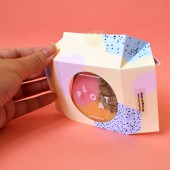
FLOAT. Packaging for Soap by Wang Min |
Home > Winners > #69547 |
 |
|
||||
| DESIGN DETAILS | |||||
| DESIGN NAME: FLOAT. PRIMARY FUNCTION: Packaging for Soap INSPIRATION: The motivation is to create a packaging for soap that appeals to millennials and minimise paper wastage. Rather than having information on several collaterals all are contained within the paper used for the packaging. To have the audience see these soap as art is the guiding principle for the visual language. Inspired by the colours, form, and vibrancy of bubbles, these qualities are translated into paint-like graphic forms that in turn manifests into abstract works of art. UNIQUE PROPERTIES / PROJECT DESCRIPTION: Guided by the concept of Life Imitates Art and inspired by the simple soap bubble, the project Float aims to make artistic soap that uplifts both consumers and their homes. Bath time is a relaxing break in the middle of the day for many people, and this effect can be enhanced by an aesthetically pleasing soap. Non-art aspects of our lives imitate art, thus through a visually pleasing everyday item, we can introduce a positive affect, which in turns improves our attitude and way of living. OPERATION / FLOW / INTERACTION: Float's packaging is made using a single sheet of paper with only folds to create a box for the soaps. Instead of having an insert, instructions and information are printed on the inside of the packaging, so that the customer can readily read them after opening as well as reduce wastage. Rather than being thrown away, the die-cut is made into a card with discount information, which the customer can choose to either use or pass to another person. PROJECT DURATION AND LOCATION: This self-initiated project started in August 2016 and finished in December 2016 in Singapore. FITS BEST INTO CATEGORY: Packaging Design |
PRODUCTION / REALIZATION TECHNOLOGY: 200 gsm paper stock, plastic transparency, clear sticker with white UV printing SPECIFICATIONS / TECHNICAL PROPERTIES: Width 70mm x Depth 30mm x Height 70mm TAGS: soap, packaging, eco-friendly, trendy RESEARCH ABSTRACT: Research on existing packagings and latest trends in soap packaging were conducted. A small sample group of 4 who fall within the millennial age range are given 3 different prototype packagings and asked on which they think works best as well as is appealing to them. CHALLENGE: The challenge lies in creating a packaging that (1) showcases the product, (2) allows for ease of mass production, (3) is created from a single, rectangular sheet of paper rather than falling back on the usual box templates. ADDED DATE: 2018-06-30 14:17:06 TEAM MEMBERS (1) : Wang Min IMAGE CREDITS: Image #1: Wang Min, Image #2: Wang Min, Image #3: Wang Min, Image #4: Wang Min, Image #5: Wang Min |
||||
| Visit the following page to learn more: http://bit.ly/2w0SHhG | |||||
| AWARD DETAILS | |
 |
Float. Packaging For Soap by Wang Min is Winner in Packaging Design Category, 2018 - 2019.· Read the interview with designer Wang Min for design FLOAT. here.· Press Members: Login or Register to request an exclusive interview with Wang Min. · Click here to register inorder to view the profile and other works by Wang Min. |
| SOCIAL |
| + Add to Likes / Favorites | Send to My Email | Comment | Testimonials | View Press-Release | Press Kit |
Did you like Wang Min's Packaging Design?
You will most likely enjoy other award winning packaging design as well.
Click here to view more Award Winning Packaging Design.


