|
|
|

|
|
| DESIGN DETAILS |
DESIGN NAME:
Astra Make-up
PRIMARY FUNCTION:
Company Re-branding
INSPIRATION:
Astra Make-Up is an Italian consumer brand, that aspires to become the essential ally of every woman. The brand desires to express the consumer’s personality, wanting to express their inner creativity, emphasizing their charm. Dynamic, free, brave, and impulsive is the woman that the new brand Astra make-up represents through a simple and fresh identity that is both elegant and recognizable on the new packaging design. The claim, Be You was created to express and accompany the brand.
UNIQUE PROPERTIES / PROJECT DESCRIPTION:
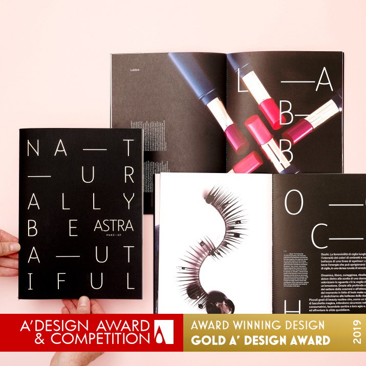
The power of the brand lies not only in its ability and vision, but also in communication. An easy to use catalogue filled with strong product photography; an consumer orientated and appealing website that provides on-line services and an overview of the brands products. We also developed a visual language in the representation of the brand sensation with a fashion style of photography and a line of fresh communication in social media, establish a dialogue between the company and consumer.
OPERATION / FLOW / INTERACTION:
The end user engage directly with the new brand through different level of comunication: the elegant, simple packaging and the captivating, strong, advertising photography used for editorial, social media and company website.
PROJECT DURATION AND LOCATION:
November 2017 - March 2018
|
PRODUCTION / REALIZATION TECHNOLOGY:
To strengthen Astra’s new brand identity, Salt & Pepper has designed a new font to be used throughout the communication: POS, catalogue, folders and website.
The other main objective of Astra rebranding was to raise the quality perception of the products by raising the quality of photography, both still life and portrait.
SPECIFICATIONS / TECHNICAL PROPERTIES:
Corporate brochure 200 x 280mm, Catalog 200 x 280mm, packaging: different format, web design:
TAGS:
Type/Font Design, Identity design, Advertising, Catalog, Web, Packaging, Photography, Social media content, Video
RESEARCH ABSTRACT:
Through market research, it was discovered the existing brand was dated and had a low brand reputation. The aim of the re-branding addressed this problem on two fronts:
1.B2B raising awareness and realigning the brand integrity
2.B2C as the company had never directly engaged the consumer, the integration and strategy of a new targeted campaign addressed areas of communication weakness. New areas of engagement were developed with higher profile communication strategy.
CHALLENGE:
The most challenging part of the process was changing the internal perceptions from a B2B marketing campaign to a strategy of a customer-centric branding. The new brand needed to appeal to a wider costumer base and new and challenging markets through a new way to represent the products and to correct their brand reputation.
ADDED DATE:
2018-06-29 08:03:27
TEAM MEMBERS (8) :
Art Director: Paul Henry Robb, Production Manager: Dino Piccinelli, Graphic Designers: Moira Bartoloni, Federica Simone, Advertising photographer: Susi Belianska, Product photography: Paul Robb, 3D designer: Naser Imache, Web designer: Barbara Rosso and
IMAGE CREDITS:
Image #1-5 : Salt&Pepper
PATENTS/COPYRIGHTS:
Project © Salt&Pepper Snc
|
| Visit the following page to learn more: http://salt-pepper.it/ |
|
| CLIENT/STUDIO/BRAND DETAILS |
 |
NAME:
Salt & Pepper
PROFILE:
Based in Perugia central Italy, we infuse design and technology with a human element, creating experiences which capture and expand upon our clients’ visions.
Over the past 20 years, we have created and developed, integrated solutions, campaigns, and products for a diverse portfolio of brands, both in the private and public sectors, in Italy and internationally. We have developed brands, websites, mobile and tablet apps, events, documentaries, viral films, digital installations, games, retail experiences, social media channels and even found time to produce some advertising.
|
|
|
| COMMENTS |
| Giulia Esposito |
Comment #7664 on December 26, 2022, 6:07 am |
|
I'm absolutely in awe of the work that has gone into the re-branding of Astra Make-up. The creativity and skill behind the visuals has been perfectly executed and is sure to make a lasting impression on potential customers. It is an incredibly powerful piece of advertising that clearly communicates the message of the brand. The colors and graphics used are bold and eye-catching and the overall design is truly unique. It's no surprise that this work has been recognized by the A' Design Award. I'm certain that Paul Robb - Salt&Pepper's work on Astra Make-up will have a long-lasting impact on the industry.
|
| Victoria Hill |
Comment #28844 on January 3, 2023, 9:06 am |
|
Astra Make-up is an awe-inspiring design achievement, deserving of the highest honor in the A' Design Awards. This re-branding succeeds in communicating the company's vision and personality to their customers through an easy-to-use catalogue filled with strong product photography, an appealingly consumer-oriented website, and a fresh visual language in its representation. The Be You claim perfectly captures the brand's message and expresses the inner creativity and charm of the consumer. The most impressive part of the project was the transition from a B2B marketing campaign to a customer-centric branding which successfully increased the brand's appeal to a wider costumer base and new markets. To top it all off, the new font designed by Salt & Pepper and the high-quality photography used to represent the products truly raise the quality perception of the brand. Astra Make-up is a remarkable example of what can be accomplished through good design.
|
| Valentina Rossi |
Comment #32541 on January 3, 2023, 10:24 am |
|
This award-winning work is an excellent example of how creativity, communication, and research can come together to create a powerful brand identity. Its use of a fashionable photography style and strategic social media communication was an innovative way to engage consumers and build brand loyalty.
|
| Patricia Miller |
Comment #36928 on January 3, 2023, 11:51 am |
|
This award-winning work is a remarkable example of creative and effective re-branding that successfully communicates a powerful message and builds a strong brand connection.
|
| Paul Williams |
Comment #44962 on January 3, 2023, 2:55 pm |
|
Astra Make-up is an exemplary piece of Advertising, Marketing and Communication Design, as recognized by its winning of the A' Design Award. The work is a masterfully executed re-branding that captures the essence of the company and its values. The visual language created through strong product photography, fashion style of photography, and social media communication establishes a dialogue between the company and consumer that is both appealing and consumer-oriented. Through market research and consumer engagement, the team behind Astra Make-up was able to create a simple and fresh identity that is both elegant and recognizable in the new packaging design. The new font designed for the project serves to further strengthen the brand identity, while the quality of photography raises the quality perception of the products. Astra Make-up is an outstanding work and a shining example of good design.
|
| Paul Phillips |
Comment #51827 on January 3, 2023, 6:09 pm |
|
I am in absolute awe of the company re-branding work done by the winner of the A' Design Award. The attention to detail and the level of creativity is evident in the way the brand is presented with a catalogue of strong product photography and an appealing website that provides on-line services and an overview of the products, all of which speaks to the power of the brand. The visual language employed is truly captivating, with a fashion style of photography and a line of fresh communication in social media creating a dialogue between the company and consumer. It is no surprise that this work has been recognized as the best of its kind. Bravo!
|
| Elena Petrenko |
Comment #55249 on January 3, 2023, 7:48 pm |
|
This award-winning work truly embodies the spirit of creativity, innovation and excellence in design.
|
| Adam Harris |
Comment #55469 on January 3, 2023, 7:54 pm |
|
I have to say that I am truly impressed by the award-winning work of Astra Make-up. The effort put into it to re-brand the company is evident in the beautiful visuals, strong product photography and user-friendly catalogue. The brand identity is simple and elegant, yet recognizable and eye-catching. I was also intrigued to read about the challenges in changing the internal perceptions and creating a customer-centric strategy. This work is a great example of creativity, skill and dedication, and it is no surprise that it won the A' Design Award.
|
| Chloe Turner |
Comment #63093 on January 3, 2023, 11:32 pm |
|
What a stunning accomplishment! The "Astra Make-Up" re-branding by Paul Robb - Salt&Pepper really stands out and is a true testament to the power of design. The brand is brought to life with a simple and fresh identity that is both elegant and recognisable. It is a truly inspiring piece of work that carries a strong message of self-expression and creativity. It is clear that the design team put a great deal of thought, care and skill into creating this award-winning work and I am delighted that it has been recognised with the A' Design Award. Congratulations to Paul Robb - Salt&Pepper for this outstanding achievement!
|
| Mark Allen |
Comment #64094 on January 3, 2023, 11:58 pm |
|
This award-winning work is a perfect example of how creativity and innovation can be used to create a strong brand identity that resonates with its target audience. The combination of a powerful visual language, high-quality photography, and an engaging communication strategy has enabled the company to reach a wider customer base and improve their brand reputation. It is truly inspiring to see how a design team can transform a company's image through a thorough research-based and strategic approach.
|
| Elisabeth Clark |
Comment #65398 on January 4, 2023, 12:31 am |
|
I'm so impressed by Paul Robb - Salt&Pepper's award-winning work, "Astra Make-up". It's a perfect example of how to successfully re-brand a company and create a strong consumer presence. The research behind the work was extremely thorough and the team's creativity in designing a visual language that captures the brand identity is truly remarkable. It's inspiring to see how they were able to take a dated brand and transform it into something fresh and modern. Congratulations to Paul Robb - Salt&Pepper for their well-deserved win of the A' Design Award!
|
| Hien Nguyen |
Comment #78216 on January 4, 2023, 6:45 am |
|
I am truly impressed by Paul Robb - Salt&Pepper's award-winning work titled "Astra Make-up". Their re-branding efforts have been commended and rewarded with this distinguished A' Design Award, a testament to their creative ingenuity and hard work.
|
|
|
Did you like Paul Robb-Salt&pepper's Advertising Design?
You will most likely enjoy other award winning advertising design as well.
Click here to view more Award Winning Advertising Design.
Did you like Astra Make-Up Company Re-Branding? Help us create a global awareness for good advertising design worldwide. Show your support for Paul Robb-Salt&pepper, the creator of great advertising design by gifting them a nomination ticket so that we could promote more of their great advertising design works.
|
|

|
NEWS Results will be Announced to Public on April 15, 2026.
Visit this page on April 15, 2026 to see the worlds' leading designs, ideas, trends and concepts in 2026.
REGISTRATIONS OPEN Registration to A' Design Award & Competition 2025-2026 period is now open.
Register and upload your design today to know how good your design is: get a complimentary preliminary score. 
|
|


