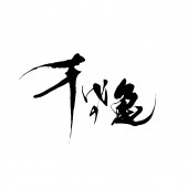
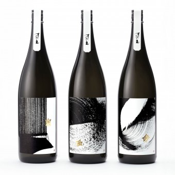
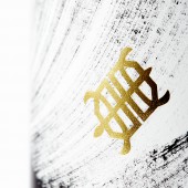
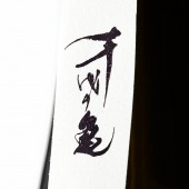
Souryu Sake Package Design by Yoshiki Uchida |
Home > Winners > #69367 |
| CLIENT/STUDIO/BRAND DETAILS | |
 |
NAME: Chiyonokame PROFILE: Chiyonokame Shuzo, located in Uchiko town, Ehime, Japan is a sake brewery that has inherited their philosophy to show respect to local rice, water and air in order to create high quality sake over 300 years since Edo period.Souryu is developed under the purpose in order for the brewery to be loved by local communities by contributing them which is the wish of the predecessor. As a result, the brewery received a good reputation from their clients which include restaurants and the new target consumer groups which made possible to expand their business overseas. |
| AWARD DETAILS | |
 |
Souryu Sake Package Design by Yoshiki Uchida is Winner in Packaging Design Category, 2018 - 2019.· Read the interview with designer Yoshiki Uchida for design Souryu here.· Press Members: Login or Register to request an exclusive interview with Yoshiki Uchida. · Click here to register inorder to view the profile and other works by Yoshiki Uchida. |
| SOCIAL |
| + Add to Likes / Favorites | Send to My Email | Comment | Testimonials | View Press-Release | Press Kit |
Did you like Yoshiki Uchida's Packaging Design?
You will most likely enjoy other award winning packaging design as well.
Click here to view more Award Winning Packaging Design.


