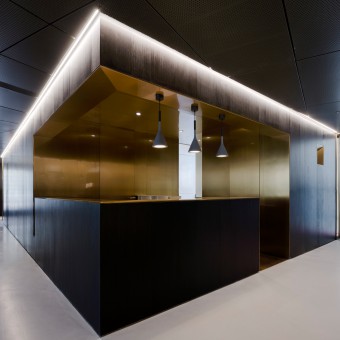
One Casa Exhibition Hall Exhibition Hall by Lei Fang |
Home > Winners > #69016 |
 |
|
||||
| DESIGN DETAILS | |||||
| DESIGN NAME: One Casa Exhibition Hall PRIMARY FUNCTION: Exhibition Hall INSPIRATION: Under the design concept of people first and dynamic experience, One Casa Exhibition Hall aims at exploring a new aesthetic sign and creating a paradise full of surprises and enlightenment. UNIQUE PROPERTIES / PROJECT DESCRIPTION: The concept of abstractness endows the lines with various meanings. Just like the footprints left by everyone in his or her life, different meanings are distributed among them, leading to unlimited possibilities. In the One Casa Exhibition Hall of OneHouse Design, there is also an unlimited line, of which every direction leads to numerous ways for opening space. OPERATION / FLOW / INTERACTION: The core moving line is spread and continued naturally, endowing the observer with multiple routes. The wall pocket has been transformed into the link through which the exhibit dialogues with the guest, adding the enjoyment. PROJECT DURATION AND LOCATION: The project started in October 2017 in Shanghai and finished in March 2018 in Shanghai. FITS BEST INTO CATEGORY: Interior Space and Exhibition Design |
PRODUCTION / REALIZATION TECHNOLOGY: In the One Casa Exhibition Hall, the exploratory design expression is applied, and all functional spaces are distributed there in a flowing way, shaping a rich situation as well as an organic, interactive and complete experience of living at home. SPECIFICATIONS / TECHNICAL PROPERTIES: Researched and developed original furniture and creative products are displayed in the One Casa Exhibition Hall in a centralized way, with the brand image of One House highlighted. The design team, by breaking the original square space layout, completed the exploration of and exchange with space and products full of various sceneries and changing view-points, with different materials and techniques of expression and based on the family scenarized design. TAGS: interior, modern, simple, exhibition hall, furniture, showroom, terrace RESEARCH ABSTRACT: In the One Casa Exhibition Hall, the exploratory design expression is applied, and all functional spaces are distributed there in a flowing way, shaping a rich situation as well as an organic, interactive and complete experience of living at home. The new integration and balancing between home and display spaces is sought, the series connection of lines are set, the characteristics of furniture are shown in the life-oriented scenario, and the perception of guests for the space and their wish for good life are stimulated. CHALLENGE: The customized showing shelves on both ends of living room match with the architectural window. The carpet with wonderful colors and patterns reduce monotony, and at the same time, a visual relationship is generated between the showing stand close to wall surface and the stand & ceiling lamp, and a sense of extension of living room is shaped through the accurate mastering of product position and proportional relation. ADDED DATE: 2018-06-22 10:24:28 TEAM MEMBERS (5) : Founder: Lei Fang, Designer: May Wang, Assistant: Fongyuen Zhou, Visual Merchandiser: Wendy Li and Visual Merchandiser: Diana Wang IMAGE CREDITS: Image #1: Photographer Peter Dixie, Reception Area, 2017. Image #2: Photographer Peter Dixie, Showcase, 2017. Image #3: Photographer Peter Dixie, Entrance, 2017. Image #4: Photographer Peter Dixie, Exhibition Area, 2017. Image #5: Photographer Peter Dixie, Toilet, 2017. |
||||
| Visit the following page to learn more: http://www.onehousesh.com/ | |||||
| AWARD DETAILS | |
 |
One Casa Exhibition Hall Exhibition Hall by Lei Fang is Winner in Interior Space and Exhibition Design Category, 2018 - 2019.· Read the interview with designer Lei Fang for design One Casa Exhibition Hall here.· Press Members: Login or Register to request an exclusive interview with Lei Fang. · Click here to register inorder to view the profile and other works by Lei Fang. |
| SOCIAL |
| + Add to Likes / Favorites | Send to My Email | Comment | Testimonials | View Press-Release | Press Kit |
Did you like Lei Fang's Interior Design?
You will most likely enjoy other award winning interior design as well.
Click here to view more Award Winning Interior Design.


