J'adore Residence by Keller Chen, Howard Huang and Lara Li |
Home > Winners > #68811 |
 |
|
||||
| DESIGN DETAILS | |||||
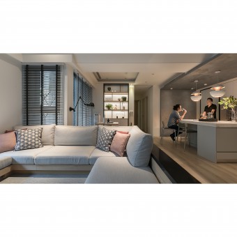
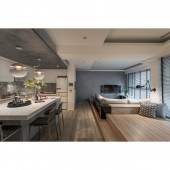
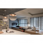
| DESIGN NAME: J'adore PRIMARY FUNCTION: Residence INSPIRATION: The clients are a young couple who enjoy gourmet foods and cooking, as well as inviting friends to their home for social gatherings, outside their busy working life, therefore the design was centered on an open-planning format with consideration for comfortable and friendly human interaction, where any place in the space would be suitable for casual chat, as well as accommodating making pasta with hand on the kitchen island while enjoying beautiful wine, and such vision gives rise to the motivation for the design. UNIQUE PROPERTIES / PROJECT DESCRIPTION: Different materials were used to shape such relaxing environment, and as the original partitioning is removed, the open kitchen with island benchtop on elevated timber flooring and sofa area on lowered-floor, while the interior space is flooded with ample light brightening up the greenery plant, like a holiday retreat. The grey L-shape ceiling in the kitchen echoes with the grey wall in the living room, as a visual extension, while the lighting in patterned tiles, ceiling, and elevated flooring turn the space into a holiday villa during the day, a lounge space in the evening. OPERATION / FLOW / INTERACTION: As the original partitioning made the original space seem small and cramped, hence the whole face of windows was obstructed, therefore, to remove the intermediate partitioning to release the space, as well as to restore the entire window face, while light is reflected on the white ceiling, the space is lit up and visually enlarged, as well as having opened up the previously closed-off kitchen space with island table-top, which not only rectify the issue of insufficient space in the kitchen but also linked up with the living area, bringing people's interaction closer and closer. PROJECT DURATION AND LOCATION: The project was completed in February 2018 in Hsinchu City. FITS BEST INTO CATEGORY: Interior Space and Exhibition Design |
PRODUCTION / REALIZATION TECHNOLOGY: Black, grey, white hexagonal tile, wooden-texture tile, Spanish-pattern tile, genuine timber, composite flooring, special paint, quartz stone By removing the original polished quartz tiles, it was placed with wooden-textured tiles, along with the texture of the genuine timber flooring, to give more sense of layering to the extension of space, brings about a sense of tranquility, while they grey wall surface extends to the ceiling becoming the visual focus in the space. SPECIFICATIONS / TECHNICAL PROPERTIES: The project residence is of 100 square meters and located in an apartment building with elevators. After the partitioning walls are removed, while considering the ceiling height, we decided to exert a decoratively tapering of the main beam to bring relief to the visual oppressiveness, while the open-plan design promotes horizontality so that the living room comes to encompass the dinner and kitchen area, in a synergetic fashion, as the layout of the horse-shoe sofa in the living room opens up more social possibility for the space. TAGS: Residential Space, Black, Grey, White Hexagonal Tile, Wooden-Texture Tile, Spanish-Pattern Tile, Genuine Timber, Composite Flooring, Special Paint, Quartz Stone RESEARCH ABSTRACT: By removing the original partitioning to open up the previously closed-off kitchen, it allows the living room, dining and kitchen areas to link up to broaden the originally narrow and cramped space, as well as amplify the spatiality of the public space. The beams and columns were designed to be concealed within the tapered ceiling, as the layered demarcation of areas raise the ceiling but also minimize the presence of the space boundaries. CHALLENGE: In the not-too-large space, over-riding the original limitation posed by partitioning and kitchen, human interaction was considered from a new perspective to educate the diversification of the designed space, as the design team strived to give the owners a space of their own, just for them. ADDED DATE: 2018-06-15 05:47:09 TEAM MEMBERS (3) : Keller Chen, Howard Huang and Lara Li IMAGE CREDITS: HK Design |
||||
| Visit the following page to learn more: https://bit.ly/2VfuW4d | |||||
| AWARD DETAILS | |
 |
J'adore Residence by Keller Chen, Howard Huang and Lara Li is Winner in Interior Space and Exhibition Design Category, 2018 - 2019.· Read the interview with designer Keller Chen, Howard Huang and Lara Li for design J'adore here.· Press Members: Login or Register to request an exclusive interview with Keller Chen, Howard Huang and Lara Li. · Click here to register inorder to view the profile and other works by Keller Chen, Howard Huang and Lara Li. |
| SOCIAL |
| + Add to Likes / Favorites | Send to My Email | Comment | Testimonials | View Press-Release | Press Kit |
Did you like Keller Chen, Howard Huang and Lara Li's Interior Design?
You will most likely enjoy other award winning interior design as well.
Click here to view more Award Winning Interior Design.


