Riba Leve Beer Label by Ruis Vargas |
Home > Winners > #68045 |
 |
|
||||
| DESIGN DETAILS | |||||
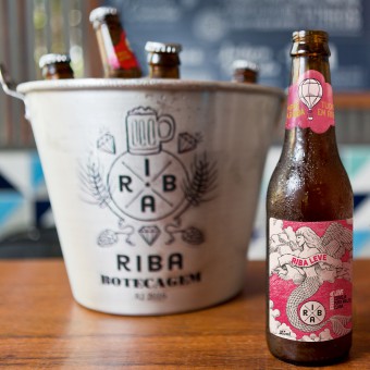
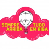
| DESIGN NAME: Riba Leve PRIMARY FUNCTION: Beer Label INSPIRATION: The mermaid's icon permeates the imaginary construction of the Riba brand. The figure of this mythical being is used in different media, through different graphic re-readings in the communication. The icon is fundamental in the construction of the imaginary, because it refers to the sea - present in the life of the Brazilian - and the sailors and their tattoos - that inspired the construction of the Riba brand. Thus, for the light Riba beer, an unexpected reinterpretation of mermaid was conceived in its more classic version - bird-headed body of a woman - composing a surrealistic and lyrical scene. UNIQUE PROPERTIES / PROJECT DESCRIPTION: Riba is a famous bar and restaurant in Rio de Janeiro. The label of his new beer had to translate the idea of lightness of the new product. Laika conceived the image of a mermaid, icon of the Riba brand, with wings, floating in the clouds. About the visual concept, in Portuguese, the word "leve" means light, light to the point of taking flight. Hence the polysemy with the flying mermaid and, by extension, the analogy with the balloon present in the gargaleira. The objective was to reach the female audience and goers of the beaches of Rio. OPERATION / FLOW / INTERACTION: The Riba light product is an important component in the goal of composing a complete brand experience for the consumer. Its products allow diversified audience reach, offering diversified gastronomic experiences. Thus, a beer like Riba light complements fundamental aspects in the expansion of these experiences, since it allows to expand the brand loyalty to the female audience, offering a beer that goes and meets your taste buds. Riba is, above all, a way of life. PROJECT DURATION AND LOCATION: The project started in June 2017 and finished in January 2018 in Sao Paulo, Brazil. FITS BEST INTO CATEGORY: Packaging Design |
PRODUCTION / REALIZATION TECHNOLOGY: The label was produced in flexography and, in its composition, the combination of three special colors (pantone), magenta (812C), green (381C) and graphite gray (412C) were used. Such combination allowed a vibrant label and in tune with the Brazilian tropicalismo, besides preserving the naturalness of the trace in hachura technique of the illustration. The gargaleira, expanding the concept of lightness (flight), in its cut, mimics the cloud format. SPECIFICATIONS / TECHNICAL PROPERTIES: In the composition of the label, care was taken to create two distinct areas of information, with equally distinct functions. The first, the face, refers to the aesthetic-conceptual aspect and obligatory information in Brazilian beverage label patterns. The second area is devoted to technical aspects of the consumer product, distributed over flat color and without noise. Dimensions of the label: 160X80 mm. Gargoyle dimensions: 80X40 mm. TAGS: Package, label, illustration, visual identity, Laika design, brand RESEARCH ABSTRACT: The Laika method is based on the complete synergy between language skills and pictorial aspects of communication. Every project begins with the construction of meaning (semiological aspect) and the need to design small graphic narratives pertinent to the brand. Thus, the Riba Leve beer label expands upon the detailed and strategic work of building an imaginary universe that represents the culture of the Riba brand, in synergy with the Brazilian way of being. CHALLENGE: The challenge was to construct, for the label and light Riba, a synthetic image, striking and unusual, that permeated imagery-discursive concepts belonging to the universe of the brand. The discursive synthesis tried to potentiate the aesthetic perception of the label and generate a positive annoyance, inviting the consumer to know and taste the product. In addition, the inventive and aesthetic aspect of the label could not overlap with the informational and functional aspects of the label, evidencing the Riba brand. ADDED DATE: 2018-04-08 05:10:12 TEAM MEMBERS (1) : Ruis Vargas, Creative Director and Illustrator, and Thiago Siqueira, Art Assistant IMAGE CREDITS: Anna Fischer |
||||
| Visit the following page to learn more: http://www.laika/com.br | |||||
| AWARD DETAILS | |
 |
Riba Leve Beer Label by Ruis Vargas is Winner in Packaging Design Category, 2018 - 2019.· Read the interview with designer Ruis Vargas for design Riba Leve here.· Press Members: Login or Register to request an exclusive interview with Ruis Vargas. · Click here to register inorder to view the profile and other works by Ruis Vargas. |
| SOCIAL |
| + Add to Likes / Favorites | Send to My Email | Comment | Testimonials | View Press-Release | Press Kit |
| COMMENTS | ||||||||||||||||||||
|
||||||||||||||||||||
Did you like Ruis Vargas' Packaging Design?
You will most likely enjoy other award winning packaging design as well.
Click here to view more Award Winning Packaging Design.


