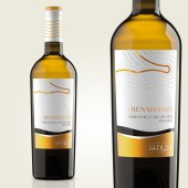
The Sands Wine Labels Wine labes by Giovanni Murgia |
Home > Winners > #67776 |
 |
|
||||
| DESIGN DETAILS | |||||
| DESIGN NAME: The Sands Wine Labels PRIMARY FUNCTION: Wine labes INSPIRATION: The sand and its movements, the sea that erase them every time. The inspiration came from this to represent this characteristic in a graphic and elegant way. UNIQUE PROPERTIES / PROJECT DESCRIPTION: The concept of these labels starts from the unique characteristic of these wines: the sand. In fact, the vines grow on the sea sand just a short distance from the coast. On the labels this concept is made with an embossing technique to take up the designs on the sand of the Zen gardens. The label is divided on two different cards: on top a natural ideal paper for embossing, on the bottom a metallic paper that gives a touch of color and personality to the design. The three labels put together make up a unique design in which the colored element becomes the link between them. OPERATION / FLOW / INTERACTION: The design of these labels has been designed to give a tactile effect when the bottle is taken in hand, thanks to the dry embossing and the natural texture of the paper. The visual effect is given by the impact color that distinguishes the different labels. Next to each other, the design of the labels joins like a single drawing on the sand. PROJECT DURATION AND LOCATION: Project started in January 2018 and finished in May 2017 in Sassari (SS - Italy) FITS BEST INTO CATEGORY: Packaging Design |
PRODUCTION / REALIZATION TECHNOLOGY: For these labels, at the top, we used a very fine natural paper texture with a warm and pleasant touch. On this label a dry relief has been created that recalls the drawings of the sand. A metal foil colored gives identity and personality to the different labels. In the part below, a metallized paper was used which was then colored with a pantone color matched to the lamina. The personalized capsule recalls the label design and completes the packaging design project. SPECIFICATIONS / TECHNICAL PROPERTIES: Labels have a total dimension 83x130 mm divided on two section with different papers: on top a natural paper, on bottom a metallic film. TAGS: wine, label, packaging, wine label design RESEARCH ABSTRACT: The research for this project started from the current sales data of the wines and their positioning perceived by the public. Based on a qualitative focus group of 20 people, we tested the comparison between the old labels and the current proposals, asking them to place the wines on a scale of quality and price. The results then emerged as the definitive choice on which we made a small quantitative panel test in some wine shops, recording excellent results on the perception of quality of wines and the choice of label design. This led us to finalize the project on the insights that emerged during the research. CHALLENGE: The creative challenge was to transfer the unique characteristic of this winery and this territory into new labels with a modern and minimal style, but linked to the values of the territory. We tried to find elements of continuity with the old labels, but creating a completely new and minimalist design. Sand designs have a tactile element that makes them three-dimensional and more incisive from them without being too intrusive. The color that differentiates each label gives style and identity to each of them. The soft and sinuous lines of the label recall the sea and the sand of Sardinia ADDED DATE: 2018-03-30 10:06:14 TEAM MEMBERS (3) : Art Director: Giovanni Murgia, Rendering images: Bruno Haver and Print: Juliagraf SpA IMAGE CREDITS: Image #1: 3DRender: Bruno Haver Optional Image #1: 3DRender: Bruno Haver Optional Image #2: 3DRender: Bruno Haver Optional Image #3: 3DRender: Bruno Haver Optional Image #4: 3DRender: Bruno Haver PATENTS/COPYRIGHTS: No copyrights on this project |
||||
| Visit the following page to learn more: https://goo.gl/8UuB8v | |||||
| AWARD DETAILS | |
 |
The Sands Wine Labels Wine Labes by Giovanni Murgia is Winner in Packaging Design Category, 2017 - 2018.· Read the interview with designer Giovanni Murgia for design The Sands Wine Labels here.· Press Members: Login or Register to request an exclusive interview with Giovanni Murgia. · Click here to register inorder to view the profile and other works by Giovanni Murgia. |
| SOCIAL |
| + Add to Likes / Favorites | Send to My Email | Comment | Testimonials | View Press-Release | Press Kit | Translations |
Did you like Giovanni Murgia's Packaging Design?
You will most likely enjoy other award winning packaging design as well.
Click here to view more Award Winning Packaging Design.


