The Ventroom Web Design by Stella Chenjie Guan |
Home > Winners > #67653 |
 |
|
||||
| DESIGN DETAILS | |||||
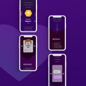
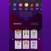
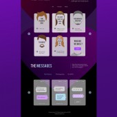
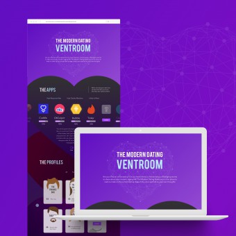
| DESIGN NAME: The Ventroom PRIMARY FUNCTION: Web Design INSPIRATION: This project is part of a bigger initiative that the designer and creator is embarking on to write a book about millennial adult life. She reflects on her own experience with modern dating and created this web project as a landing page to gather user feedback and data about the frustrations, debate and concerns about online dating among millennial adults. UNIQUE PROPERTIES / PROJECT DESCRIPTION: This web project took a satirical approach to examine the frustrations of modern dating. It is designed to inspire deeper reflections of the dating culture we are facing and spark discussions around important topics like shopping cart mentality, ghosting and online sexual harassment. The webpage is designed to be fully interactive in each section. Users can scroll through carousel sliders, submit their own opinions and vote. OPERATION / FLOW / INTERACTION: The 1st section is a carousel slider presenting some of the most popular dating apps (with satirical names). Users can vote if they like or dislike the app and the data will be shown in percentages. In the 2nd section, users will see illustrated dating profiles. Each profile card will "flip" to the back side showing a brief description when hovered or clicked. Users can submit their own opinions. In the 3rd section, users will see real messages filtered into categories submitted by other users. Users can also submit messages that they have received from dating apps before. PROJECT DURATION AND LOCATION: The ideation phase of the this project started in late 2017. An initial concept was developed in January, 2018. Preliminary design began in February, 2018. Final design was completed in March, 2018. Web development began in March, 2018 and due to be finished in April, 2018. |
PRODUCTION / REALIZATION TECHNOLOGY: I started this project with the idea of writing a book about millennial adult life based on my own experience and research from interviews, focus groups etc. As a designer, I was inspired to create something visually to conduct research. Designed as a simplified journey, this page guides users through the modern online dating process from downloading apps to scrolling through profiles to eventually messaging back and forth with matches. SPECIFICATIONS / TECHNICAL PROPERTIES: This webpage is designed as a responsive website. It will scale proportionately according to browser size and device types. TAGS: web design, landing page design, online dating, responsive design, interaction design, visual design RESEARCH ABSTRACT: This web project is designed as part of a research project to gather public opinions and user anecdotes about modern online dating. The methodology used here is simple - let users vote and submit their own opinions as this type of research belongs to the popular culture bracket and not scientific. CHALLENGE: The original idea for the 1st section was to display numbers of "likes" and "dislikes" from user voting. After conducting some initial alpha testing and gathering feedback from a small group of design professionals, I realized that it is not the best approach to lump all dating apps together for users to vote as they cater to different niches and the numbers will inevitably skew in favor of some apps and biased for others. Therefore, I changed the design to let the user pick from 3 categories to vote and only display percentages as the result, which would be more fair to all the apps. ADDED DATE: 2018-03-29 04:01:42 TEAM MEMBERS (3) : Creative Director & Designer: Stella Chenjie Guan, Web Developer (in progress): Gleb Bero, Narek Sahakyan and IMAGE CREDITS: Illustration credits: Yuriy Kostin PATENTS/COPYRIGHTS: Not applicable |
||||
| Visit the following page to learn more: http://bit.ly/2GWNz5u | |||||
| AWARD DETAILS | |
 |
The Ventroom Web Design by Stella Chenjie Guan is Winner in Website and Web Design Category, 2017 - 2018.· Read the interview with designer Stella Chenjie Guan for design The Ventroom here.· Press Members: Login or Register to request an exclusive interview with Stella Chenjie Guan. · Click here to register inorder to view the profile and other works by Stella Chenjie Guan. |
| SOCIAL |
| + Add to Likes / Favorites | Send to My Email | Comment | Testimonials | View Press-Release | Press Kit |
Did you like Stella Chenjie Guan's Web Design?
You will most likely enjoy other award winning web design as well.
Click here to view more Award Winning Web Design.


