Gin Manners Gin Bottle by Estudio Maba |
Home > Winners > #67585 |
 |
|
||||
| DESIGN DETAILS | |||||
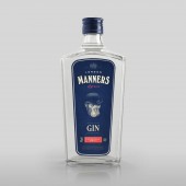
| DESIGN NAME: Gin Manners PRIMARY FUNCTION: Gin Bottle INSPIRATION: For the choice of the bottle, we take into account typical forms of the classic English perfumery as well as the classical London Gin recipes universe, although the graphic elements suffer a very personal interpretation under the treatment of the brand. UNIQUE PROPERTIES / PROJECT DESCRIPTION: The thing about gin is that is can be drunk in such very different circumstances, during the day, when relaxing after lunch, or at night, amid the noise of the disco. The desire to create a gin that would be equally popular in such different situations was a decisive factor in the decision to develop a new brand. Manners was designed as an all-inclusive project encompassing brand concept, naming, choice of container and graphic presentation. OPERATION / FLOW / INTERACTION: The aim of this project was to create an evolved version of the product, an interaction with the consumer. Gin is one of the most versatile spirit drinks, as it can be drunk at widely different times — during the day, while relaxing after lunch or having a casual chat, or when the sun goes down, amidst the unrestrained manners that can be found at a night club. PROJECT DURATION AND LOCATION: From January to September 2017 y Murcia, Spain FITS BEST INTO CATEGORY: Packaging Design |
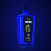
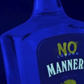
PRODUCTION / REALIZATION TECHNOLOGY: Digital printing and flexography on Tintoretto Crystal Salt. Silver foil stamping and luminescent ink. SPECIFICATIONS / TECHNICAL PROPERTIES: 95 X 70 210 mm TAGS: gin, packaging, label, luminescent, ink, black, light RESEARCH ABSTRACT: This gin is a tribute to respectful British manners, as well as to its most energetic and global movement of rebellion: Punk. When cast under a black light, the bottle transforms, taking us from polite Manners to its wilder face, No Manners, a daring conflict that represents the dual nature of the brand. CHALLENGE: Once the label was designed, we had to test and adapt it several times to find the perfect balance between colour and luminescence under a black light, so that daytime colours interfered as little as possible with the night-time version of the label. The search for the ideal type of ink, the colour restrictions, and the long hours of print testing have marked the development of this project. ADDED DATE: 2018-03-27 18:44:37 TEAM MEMBERS (3) : Concept & Graphic Design: Manel Quílez, Creative Assistant: Adrián Marzal, Beatríz Suárez, Miguel Ángel del Baño and Naming: Manel Quílez, Adrián Marzal, Beatríz Suárez, Miguel Ángel del Baño IMAGE CREDITS: Estudio Maba |
||||
| Visit the following page to learn more: http://estudiomaba.com/en/trabajos/manne |
|||||
| AWARD DETAILS | |
 |
Gin Manners Gin Bottle by Estudio Maba is Winner in Packaging Design Category, 2017 - 2018.· Read the interview with designer Estudio Maba for design Gin Manners here.· Press Members: Login or Register to request an exclusive interview with Estudio Maba. · Click here to register inorder to view the profile and other works by Estudio Maba. |
| SOCIAL |
| + Add to Likes / Favorites | Send to My Email | Comment | Testimonials | View Press-Release | Press Kit |
Did you like Estudio Maba's Packaging Design?
You will most likely enjoy other award winning packaging design as well.
Click here to view more Award Winning Packaging Design.


