The Bleached Office Workspace by PhoebeSayswow Architects Ltd. |
Home > Winners > #67432 |
 |
|
||||
| DESIGN DETAILS | |||||
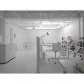
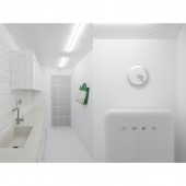
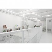
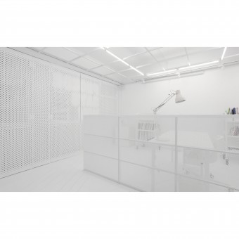
| DESIGN NAME: The Bleached Office PRIMARY FUNCTION: Workspace INSPIRATION: Visual unity with embedded rich textures and materials has been the guide line for this project. A lab like image inspired us to use white as a powerful media to stimulate creative thoughts while working in such an environment. UNIQUE PROPERTIES / PROJECT DESCRIPTION: Designed to create an lab-like working space with an rather open layout for adaptive use according to different phase of office operating. We used metal mesh for a semi opaqueness while keeping visual extension within the space at certain angle. Cedar flooring and ceiling with patterns and flake boards as pin-up walls all in white wash for an visual unity. The branding of client’s firm is amplified through the design details including window screen design and lighting fixture arrangement. OPERATION / FLOW / INTERACTION: The client uses this space as a designer's office in which flexible and open plan can be found. A restroom, common room and storage balcony are affiliated to the main working space which will accommodate up to 7 co-workers. PROJECT DURATION AND LOCATION: January 2017 to June 2017 in Taipei, Taiwan FITS BEST INTO CATEGORY: Interior Space and Exhibition Design |
PRODUCTION / REALIZATION TECHNOLOGY: Expanded metal mesh, Galvanized steel panel with laser cut patterns, Cedar wood flooring, White mix terrazzo, rebars. SPECIFICATIONS / TECHNICAL PROPERTIES: 60 square meter space TAGS: Office, White, Bleached, Parametric design, Phoebesayswow RESEARCH ABSTRACT: It was initiated from our interest in colours and patterns on the perception of spaciousness in interior design. According to Jaglarz, “Proper planning, interior elements, furniture and mirrors placement can correct every space, while colour and lighting considerations can be used to emphasise the space or place” (Jaglarz, 2011, p. 1). Colour and light are frequently used to make a space appear bigger, and a great deal of research has been done to examine the use of colour in interior design. Thorough white became our strategy for the space to visually and emotionally interact with users and hoping to bring positive energy to the work environment. CHALLENGE: To choose the right mesh type for desired opaqueness and transparency on partitions and door panels required digital simulation and sampling during process. The materiality also challenged us while assembling on site. For the front screen, digitally designed pattern needs to be accurately laid out and laser cut for the right pattern to show and for the screen to be operable smoothly. The terrazzo counter top in the common room was tested for the right recipe to be the proper white mix before casting on site. ADDED DATE: 2018-03-21 10:35:35 TEAM MEMBERS (2) : Shihhwa Hung and Phoebe Wen IMAGE CREDITS: Image #1: Photographer Shihhwa Hung, The Bleached Office, 2017. Image #2: Photographer Shihhwa Hung, The Bleached Office, 2017. Image #3: Photographer Shihhwa Hung, The Bleached Office, 2017. Image #4: Photographer Shihhwa Hung, The Bleached Office, 2017. Image #5: Photographer Shihhwa Hung, The Bleached Office, 2017. |
||||
| Visit the following page to learn more: https://www.phoebesayswow.com | |||||
| AWARD DETAILS | |
 |
The Bleached Office Workspace by Phoebesayswow Architects Ltd is Winner in Interior Space and Exhibition Design Category, 2017 - 2018.· Read the interview with designer PhoebeSayswow Architects Ltd. for design The Bleached Office here.· Press Members: Login or Register to request an exclusive interview with PhoebeSayswow Architects Ltd.. · Click here to register inorder to view the profile and other works by PhoebeSayswow Architects Ltd.. |
| SOCIAL |
| + Add to Likes / Favorites | Send to My Email | Comment | Testimonials | View Press-Release | Press Kit | Translations |
Did you like Phoebesayswow Architects Ltd's Interior Design?
You will most likely enjoy other award winning interior design as well.
Click here to view more Award Winning Interior Design.


