B&W Appartment Residential Apartment by Diego Revollo |
Home > Winners > #67053 |
 |
|
||||
| DESIGN DETAILS | |||||
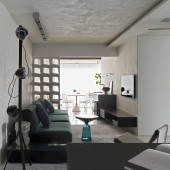
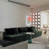
| DESIGN NAME: B&W Appartment PRIMARY FUNCTION: Residential Apartment INSPIRATION: The inspiration was the idea that in small spaces, furniture should't be small as well: a large sofa takes up almost the whole length of the main wall. On the opposite wall, a piece created with sheets of black metal, with a small part in black lacquered wood, follows the same course, increasing height and depth as it approaches the balcony. The idea of long furniture that is in line with the sofa reinforces the horizontal lines of the apartment and makes the space more fluid. UNIQUE PROPERTIES / PROJECT DESCRIPTION: The decorative composition of this apartment is the result of a trend that has been gaining strength in recent years: that of a minimal, clean décor, in which the sobriety of the whole is punctuated by specific pieces. The outcome is based on the assumption that we now live with less; there is no room to accumulate little things, nor is there time to enjoy them. It is necessary to reinvent and remodel to a trend that’s here to stay: living with less. OPERATION / FLOW / INTERACTION: - PROJECT DURATION AND LOCATION: The project lasted for 01 year. This appartment is located in Vila Olimpia neighbourhood in São Paulo - Brasil. FITS BEST INTO CATEGORY: Interior Space and Exhibition Design |
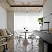
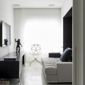
PRODUCTION / REALIZATION TECHNOLOGY: - SPECIFICATIONS / TECHNICAL PROPERTIES: 828 square feet TAGS: integrated spaces, wideness, burned cement, minimal, design, concept, modern, less RESEARCH ABSTRACT: The color palette of this Vila Olímpia apartment, in São Paulo, definitely lives up to its name: black and white delimit the 77m², which were very well used by Diego Revollo in yet another one of his projects. Located in a densely populated and business-oriented area, the residence is set in a modern, corporate and cosmopolitan setting. In his first contact with the office, the client was extremely empathic about the need to start from a design that tied up all the spaces of the apartment, with no forgotten or unused corners. It was necessary to integrate and value each square meter. CHALLENGE: The first question was, no doubt , the size of the apartment. We are speaking of a 77 m2 apartment which makes us face a very restricted area to begin with. Although the office has already made some apartments with similar areas, there is always the fear that the client will not understand that, in fact, we should restrict not only the number of rooms but also simplify functions and be reasonable using the space. One of the key points in any project of constrained area is the adoption of space integration. The office does that with mastery in small lofts projects but when the apartment has a traditional division of spaces and the area is small, this should be suggested and discussed with the client. For this apartment our first concern was precisely to increase the connection between all spaces, eliminating walls to the maximum and also making the best use of natural light. ADDED DATE: 2018-03-07 19:14:03 TEAM MEMBERS (6) : Photographer – Alain Brugier, Technical Lighting - Allure , Kitchen - Kitchens, Concrete Walls, Floor and Ceiling with Dry Shake Color Hardener Surface Treatment - Mr. Cryl, Inovart - Woodwork and IMAGE CREDITS: All images have been provided by Mr. Alain Brugier and are hereby used with his consentment and permission. |
||||
| Visit the following page to learn more: http://m.interiordesign.net/projects/145 |
|||||
| AWARD DETAILS | |
 |
B&w Appartment Residential Apartment by Diego Revollo is Winner in Interior Space and Exhibition Design Category, 2017 - 2018.· Read the interview with designer Diego Revollo for design B&W Appartment here.· Press Members: Login or Register to request an exclusive interview with Diego Revollo. · Click here to register inorder to view the profile and other works by Diego Revollo. |
| SOCIAL |
| + Add to Likes / Favorites | Send to My Email | Comment | Testimonials | View Press-Release | Press Kit |
Did you like Diego Revollo's Interior Design?
You will most likely enjoy other award winning interior design as well.
Click here to view more Award Winning Interior Design.


