DESIGN NAME: Journal Visualisation
PRIMARY FUNCTION: Application to visualise emotions
INSPIRATION: For most, a diary is a place of private introspection where one can transfer thought and feelings onto paper. When I read 'Meditations39; I felt this diary-cum-book can reveal more than what was a reader could grasp, it can reveal how Marcus Aurelius felt on the day he wrote the diary, what his emotional state was and how it changed over time. The aim was to design an application that could do these things and help users know more about themselves.
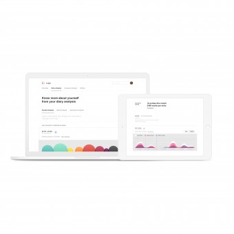
UNIQUE PROPERTIES / PROJECT DESCRIPTION: This design aims to quantify and reflect emotions by taking input from diary entries, it aims to help user knowthemselves better by presenting visualisations of their emotions and things they write about. This application tells user about their mood change over time and lets them compare their emotional state with time and location.
OPERATION / FLOW / INTERACTION: This application can show the users how frequent he/she has been with maintaining a diary and the effect location and time have on this activity. After the basic details, the user is provided with a dashboard-like interface that can provide the user with all the events that have been recorded in the diary and tell how they effected on an emotional level.
PROJECT DURATION AND LOCATION: The project started in May 2017 in Gurgaon and finished in November 2017, the complete project was done in parts over time.
FITS BEST INTO CATEGORY: Interface, Interaction and User Experience Design
|
PRODUCTION / REALIZATION TECHNOLOGY: Use of the Sketch app and leading design strategy techniques.
SPECIFICATIONS / TECHNICAL PROPERTIES: -
TAGS: Interaction Design, Flat Design, Responsive Design, Design concept, Data Visualisation
RESEARCH ABSTRACT: I initially spent a good four months doing all the research on what emotions and feelings are and how can they be quantified, I had gathered a lot of data. The next challenge was to make sense of this data and take out meaningful insights from it. I started by creating an affinity map on my whiteboards and online collaborative tools, and later created a detailed user journey map, identifying each step the user takes, and the different high/low emotional points.
CHALLENGE: -
ADDED DATE: 2018-03-05 11:16:46
TEAM MEMBERS (1) :
IMAGE CREDITS: Aviral Bohra, 2017.
|