Sweet Life Coffee Bar by Florian Studer |
Home > Winners > #66489 |
 |
|
||||
| DESIGN DETAILS | |||||
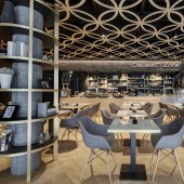
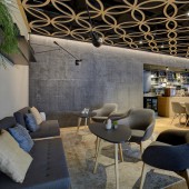
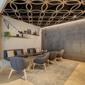
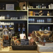
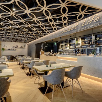
| DESIGN NAME: Sweet Life PRIMARY FUNCTION: Coffee Bar INSPIRATION: warm vs. cold, cosy vs. spacious, soft vs. rigid, crafted vs. technical UNIQUE PROPERTIES / PROJECT DESCRIPTION: The Coffee Sweet life is in a prominent location in the 2nd largest shopping center of Switzerland and is considered a rest and relaxation area. Based on the operator's concept, the focus was on natural materials that take up the naturalness of organically and fair products. For this reason, the focus was on materials such as breathing clay plaster, marble and oak. The overall design was intended to create an oasis of tranquillity in strong contrast to the Mall's technical architectural concept. OPERATION / FLOW / INTERACTION: - PROJECT DURATION AND LOCATION: Due to the short execution time of 3 month the tight timeframes for the opening of the entire mall had to be taken into account. The coffee is located in the main area of the shopping centre, opposite the main escalator on the top floor. FITS BEST INTO CATEGORY: Interior Space and Exhibition Design |
PRODUCTION / REALIZATION TECHNOLOGY: Mud plaster textured, oak parquet fishbone laid, suspended ceiling in oak, carrara marble and brass. All materials are harmoniously matched. SPECIFICATIONS / TECHNICAL PROPERTIES: 130 square metres, divided into 25 square meteres work area and 95 squaremeters guest lounge. In addition, a coffee area of around 50 square metres has been set up in the public area of the mall. The size of the entire mall is due to the high safety and fire protection regulations. This had a major impact on the freedom of choice for the materials used. TAGS: warm, cosy, soft, crafted, empathic RESEARCH ABSTRACT: - CHALLENGE: Due to the concept of the cafe the materialisation was extended to include haptically warm materials such as felt, fabric and wood. The arrangement should create a clear separation between a quiet, comfortable lounge area for the customers and a professional, hygienic work area for the employees. In order to create a connection between the guest room and the work area, a wall combination was placed behind the counter, which is repeated in the guest room. Here too, the focus was on the aspect of private space and comfort. ADDED DATE: 2018-02-28 16:22:35 TEAM MEMBERS (1) : Florian Studer IMAGE CREDITS: Armin Grässl 2018 |
||||
| Visit the following page to learn more: http://www.studer.archi | |||||
| AWARD DETAILS | |
 |
Sweet Life Coffee Bar by Florian Studer is Winner in Interior Space and Exhibition Design Category, 2017 - 2018.· Read the interview with designer Florian Studer for design Sweet Life here.· Press Members: Login or Register to request an exclusive interview with Florian Studer. · Click here to register inorder to view the profile and other works by Florian Studer. |
| SOCIAL |
| + Add to Likes / Favorites | Send to My Email | Comment | Testimonials | View Press-Release | Press Kit | Translations |
| COMMENTS | ||||||||
|
||||||||
Did you like Florian Studer's Interior Design?
You will most likely enjoy other award winning interior design as well.
Click here to view more Award Winning Interior Design.


