Timothy Taylor's Beer by Springetts |
Home > Winners > #66354 |
 |
|
||||
| DESIGN DETAILS | |||||
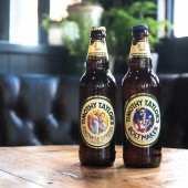
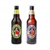
| DESIGN NAME: Timothy Taylor's PRIMARY FUNCTION: Beer INSPIRATION: The brief in brief: It’s all about ‘Know not show’. We know our beers and do not need gimmicks to sell them. The Challenge: How to stand for quality in a congested category and create a brand look and feel that appeals to existing Timothy Taylor’s drinkers, whilst attracting a new audience who appreciate and pay for a premium beer. UNIQUE PROPERTIES / PROJECT DESCRIPTION: The creative idea is based upon the celebration of the time, care and effort and the people who pour their craft and expertise into the making of these outstanding beers. Our inspiration came from the communist posters from the 1920s and 30s that showed the proud heroic everyday worker. We reflected the same upward camera angle and simple screen print style and created a modern interpretation of this. We wanted to give the brand a voice that would hero the ‘worker’. Each beer champion’s master trades person striking a pose that reflects the craftsmanship of their trade and the care and effort that goes into to making the beer. All for that Taste of Taylor’s. OPERATION / FLOW / INTERACTION: The new designs for the brand have to stand out in a congested category and appeal to existing Timothy Taylor's but with the ability to attract a new audience who appreciate and are willing to pay for premium beers. PROJECT DURATION AND LOCATION: Launched autumn 2017 FITS BEST INTO CATEGORY: Packaging Design |
PRODUCTION / REALIZATION TECHNOLOGY: Brown glass bottles Metal caps SPECIFICATIONS / TECHNICAL PROPERTIES: 500ml glass bottles TAGS: Timothy Taylor, beer, Springetts, ale, pub RESEARCH ABSTRACT: The Timothy Taylor's brand is all about ‘know not show’. The brewery knows its beers and does not need gimmicks to sell them. CHALLENGE: Timothy Taylor’s make exceptional award-winning beers. From the growers of their unique Golden Promise Barley, their Master Brewers to the landlords who keep and sell the beer - they have people who champion beer throughout the process. ADDED DATE: 2018-02-28 11:18:35 TEAM MEMBERS (2) : Creative Director: Paul Williams and Design Director: Kevin Daly IMAGE CREDITS: Springetts, 2017. |
||||
| Visit the following page to learn more: http://www.springetts.co.uk/our-work/tim |
|||||
| AWARD DETAILS | |
 |
Timothy Taylor's Beer by Springetts is Winner in Packaging Design Category, 2017 - 2018.· Read the interview with designer Springetts for design Timothy Taylor's here.· Press Members: Login or Register to request an exclusive interview with Springetts. · Click here to register inorder to view the profile and other works by Springetts. |
| SOCIAL |
| + Add to Likes / Favorites | Send to My Email | Comment | Testimonials | View Press-Release | Press Kit |
Did you like Springetts' Packaging Design?
You will most likely enjoy other award winning packaging design as well.
Click here to view more Award Winning Packaging Design.


