Handcrafted Apothecary Playing Cards Playing Cards by Alexander Chin |
Home > Winners > #66211 |
 |
|
||||
| DESIGN DETAILS | |||||
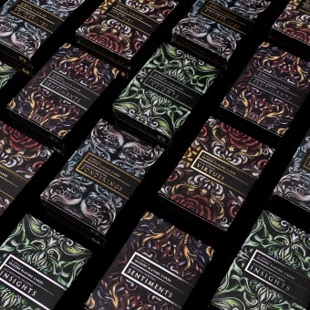
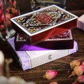
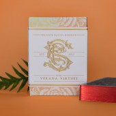
| DESIGN NAME: Handcrafted Apothecary Playing Cards PRIMARY FUNCTION: Playing Cards INSPIRATION: In a world that is going more digital Seasons wanted to explore the opposite by turning the ephemeral into the physical. The approach was to transform invisible concepts and ideas into a handcrafted user experience that one could see and feel. The Apothecary, as a purveyor of curiosity and wonder, became the theme to create a world where these intangibles embodied real elements which could be harvested into physical totems for prescription in response to our every day digital lives. UNIQUE PROPERTIES / PROJECT DESCRIPTION: The designs are inspired by vintage apothecary packaging to capture the intangibles being represented. To reflect these themes, a focus on both the visual and tangible aspects of packaging are prioritized to imbue an aura of mystery around each design. Package options including raised intaglio engravings, sculpted embossing, and heat sensitive inks to make truly responsive package designs that create a memorable experience between brand and users. OPERATION / FLOW / INTERACTION: The Apothecary challenges your notions of what playing cards should be through an unusual user experience. The packaging line features multiple variations include external intaglio labels to increase collector value, sculpted embossing to feel as if there are bulging mysteries wrapped within, and even color changing inks that will visually change to make a user pause and investigate more into the details of the package and product itself. PROJECT DURATION AND LOCATION: The four deck project was launched using two different events to construct extended exposure for the brand. The first half of the project launched in 2016. The full Apothecary line was produced over the course of 2017 in USA. The second marketing event launched in USA in 2018. FITS BEST INTO CATEGORY: Packaging Design |
PRODUCTION / REALIZATION TECHNOLOGY: Each composition is illustrated on vellum and inked. Images are vectorized in Illustrator and then colored in Photoshop to polish before submission for printing with the U.S. Playing Card Company. Standard boxes feature foiling and sculpted embossing. Limited edition decks are gilded by hand and packed in custom boxes which are coated in temperature sensitive inks. Emphasizing the craft, each deck is then wrapped, dated, and numbered in intaglio sleeves with the artist signature. SPECIFICATIONS / TECHNICAL PROPERTIES: 65mm x 12mm x 90mm (Per Box) TAGS: playing cards, apothecary, cards, intaglio, engraving, nature, seasons, natural RESEARCH ABSTRACT: To establish credibility to the prescriptive packaging and labeling, world building exercises were created for each pack. Understanding the nature of the individual items meant asking questions of when they were harvested and their composition resulting in secondary revelations of their appearances and what each would be prescribed for. This helped dictate all art direction including delightful Easter eggs like fine print copy of ingredient logs and directions of use throughout the packaging. CHALLENGE: How does one connect the unknown to something real? The best way discovered to capture something that does not physically exist is to form visual cues within the packaging on how to handle the unfamiliar. The solution was a package design system that matched intangibles with cohesive attributes. By starting with already understood concepts such as seasons and extrapolating from there, it brought both credibility and a higher level of authenticity to each story of traits each design had. ADDED DATE: 2018-02-28 02:45:10 TEAM MEMBERS (1) : Alexander Chin IMAGE CREDITS: Image #1: Photographer Sydney Poland, 2017 Image #2: Photographer Sydney Poland, 2017 Image #3: Photographer Sydney Poland, 2017 Image #4: Designer Alexander Chin, 2017 Image #5: Photographer Sydney Poland, 2017 |
||||
| Visit the following page to learn more: http://goo.gl/4SFU44 | |||||
| AWARD DETAILS | |
 |
Handcrafted Apothecary Playing Cards Playing Cards by Alexander Chin is Winner in Packaging Design Category, 2017 - 2018.· Read the interview with designer Alexander Chin for design Handcrafted Apothecary Playing Cards here.· Press Members: Login or Register to request an exclusive interview with Alexander Chin. · Click here to register inorder to view the profile and other works by Alexander Chin. |
| SOCIAL |
| + Add to Likes / Favorites | Send to My Email | Comment | Testimonials | View Press-Release | Press Kit |
Did you like Alexander Chin's Packaging Design?
You will most likely enjoy other award winning packaging design as well.
Click here to view more Award Winning Packaging Design.


