Flexibility Residence by PartiDesign Studio |
Home > Winners > #65764 |
 |
|
||||
| DESIGN DETAILS | |||||
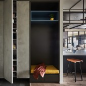
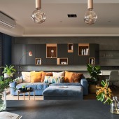
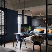
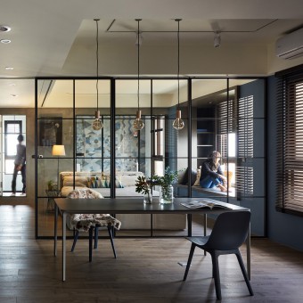
| DESIGN NAME: Flexibility PRIMARY FUNCTION: Residence INSPIRATION: We have changed the traditional Taiwanese way of living with a big TV wall in the living room, and we minimize the use area of television. These changes will increase the spaces available, allowing a better interaction between family and friends under one roof. UNIQUE PROPERTIES / PROJECT DESCRIPTION: We aimed to challenge the need for “flexible” by providing an unfoldable option for inner city living in the 125m2 apartment in Taoyuan, Taiwan. The open-plan space of this one-big-room apartment was divided into two areas to separate private and communal area with a sliding partition. OPERATION / FLOW / INTERACTION: It was with great pleasure to receive a wonderful feedback from the owners a few weeks after settlement. The couple mentioned that their house is very cool and different! Comparing to the past where they would stay outside till late, they now understand the meaning of “home, sweet home”. They are proud to present their house to their family and friends and often invite them over for a cup of tea. They mentioned the new design in this house has boosted connection and relationship between family and friends. PROJECT DURATION AND LOCATION: The project completed in November 2017 in Taoyuan, Taiwan. FITS BEST INTO CATEGORY: Interior Space and Exhibition Design |
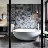
PRODUCTION / REALIZATION TECHNOLOGY: We use a series of glass and steel partitions that play a key part in subdividing areas, providing additional functions, offering privacy, and creating visual separation that also reflect the surrounding materials, creating a sense of disorientation by reflection and perspective. SPECIFICATIONS / TECHNICAL PROPERTIES: The space of the project contains the entrance, living room, kitchen, dining room, master bedroom, dressing room and a guest room. However, planning the overall space with an open plan and using the sliding partitions to flexibly use and distinguish different spaces. TAGS: flexibility , sliding partition , nature , light , RESEARCH ABSTRACT: The material and color coding were based on neuter texture. Using warm black and deep blue colored wall, tiles, steel as the core design, and wooden floor to highlight the other timber cabinets to elaborate the simple, lively and relaxing atmosphere. CHALLENGE: The challenge in this case is how to convince owners to use an almost completely open plan and to just use sliding partitions as a separation between public and private spaces. ADDED DATE: 2018-02-27 03:13:40 TEAM MEMBERS (2) : Architect: Chien Hao Tseng and Creative Director: Tzu Yu Liu IMAGE CREDITS: Photographer: Hey!Cheese |
||||
| Visit the following page to learn more: http://www.chienhaotseng.com/ | |||||
| AWARD DETAILS | |
 |
Flexibility Residence by Partidesign Studio is Winner in Interior Space and Exhibition Design Category, 2017 - 2018.· Read the interview with designer PartiDesign Studio for design Flexibility here.· Press Members: Login or Register to request an exclusive interview with PartiDesign Studio. · Click here to register inorder to view the profile and other works by PartiDesign Studio. |
| SOCIAL |
| + Add to Likes / Favorites | Send to My Email | Comment | Testimonials | View Press-Release | Press Kit |
Did you like Partidesign Studio's Interior Design?
You will most likely enjoy other award winning interior design as well.
Click here to view more Award Winning Interior Design.


