DESIGN NAME:
Corner 60’s
PRIMARY FUNCTION:
Residence
INSPIRATION:
This is a renewal project bearing the aesthetics of the old Taiwanese era, in the form of a corner building in a quiet community. We did our best in preserving the old tiles, fine stone finishing and window grille that have marked the era this building has been through.This design seeks to capture the local architectural aesthetics and the good old corridor social fabric in the old buildings, which are too often on the demise in the contemporary urban environment.
UNIQUE PROPERTIES / PROJECT DESCRIPTION:
The original site is a common Taiwanese middle-class residential dwelling, while focusing on converting the programmatic and physical shortcomings of the floor plan of such elongated building into a modern dwelling of new and enriched living possibilities; breaking down boundaries of conventional housing posed by solid partitioning, so that each newly created domain has boundless usage.
OPERATION / FLOW / INTERACTION:
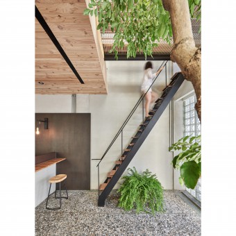
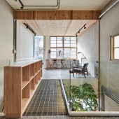
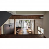
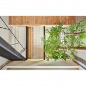
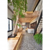
The overall environment needs to tackle the issues of poor natural illumination and ventilation. So by using materials such as glass tiles and grille, etc., as well as opening up flooring slab, we created double-height ceiling that allows the ground-floor space to become well-lit. Furthermore, by planting a large rainforest-type tree traversing the ground and the first floors, surrounding by open-planning spaces and a mini sky-walk cladded in grille, we successfully rectified the usual ill effect of sub-tropical climate normally would have on urban interior spaces.
PROJECT DURATION AND LOCATION:
November, 2017
Changhua County, Taiwan
FITS BEST INTO CATEGORY:
Interior Space and Exhibition Design
|
PRODUCTION / REALIZATION TECHNOLOGY:
By preserving the old fine-pebbles floor, mosaic tiles and patterned window grilles, as well as re-using the original large door and wooden (Taiwan Cypress, or locally known as “Hinoki”) furniture, we are hoping to preserve and re-make the craft tradition and what this aesthetics represents, in terms of its old-day living; The addition of new materials is to articulate a sense of returning to the original materiality, to the natural and bringing a sense of transparency of the new-age living, such as black iron work, solid timber pieces and glass tiles, etc., while looking to create a synergy that pays homage to the old materiality, as well as creating a new spatial visual of permeating and interwoven flow of the new materiality.
SPECIFICATIONS / TECHNICAL PROPERTIES:
As this is a three-story building of 180 square meters in area, the design team works on reinforcing and reinventing the old run-down structure, e.g. the front wooden window of the second floor and part of the flooring; also to open up what used to be a closed-off space for meeting modern living usage, while devising a few experimental design detailing to bring the exterior light and air into the interior, e.g. by utilizing the air-draining effect of trees to draw air from the ground floor to the second floor, and using the density of the foliage to adjust the ventilation intensity, an organic way to create a naturally ventilated space, which is echoed by deploying many porous materials (grille/galvanized grille) and its design.
TAGS:
-
RESEARCH ABSTRACT:
This is a three-story corner residential building built in the 70’s, which has been previously in disuse for many years, so we convert the ground-floor space to a café space, a gathering place for parents whose children come for weekend classes, or as a common gathering place of a community social corner. During the weekdays, it would be the living room for the owner; with commonly seen storage penthouse in old buildings converted to a multi-function living penthouse space, by simply preserving the wooden craft of the old structure; the front-half of the second-floor space with preserved wooden windows as recreation area, with its back half designated as classroom, in which long table layout create a usage duality of dining space and study for the owner, while a spatial linkage traversing the ground and second floors invigorated the visual and programmatic aspects of the interior space, but also having created better lit and ventilated interior environment; Third floor being the living space of the owner, with a free circular layout blurring the boundary between the bedroom and living room, allowing the owner to create their own spatial usage possibilities.
As we extend the ground-floor domain into the corridor space, we reinterpreted the utility paradigm (parking) of corridor space in many Taiwanese dwellings, by allowing this old residence to become a community social corner into which, more spatial possibilities and community memories are rendered.
CHALLENGE:
The main challenge was to resolve the ventilation problem, as this building faces an urban lane which makes it relatively difficult to improve the interior ventilation, because the seasonal breeze would usually be blocked by densely built buildings, so we decided to bring in the breeze through the lane to create the interior ventilation environment. What we did was to completely open up the ground-floor entrance as well as parts of the second-floor slab, coupling with the tree-plantation in the atrium, we successfully created a vertical light and wind atrium between the floors; Furthermore, the skywalk between the front and back of the second floor, as well as the new staircase leading to the old-window living space of the second floor, both provided penetrating gap to allow free-flowing air throughout the interior space.Also, the elongated floor plan forced the owner to layout the living space at the front and back, which, apart from creating an elongated circulation path, also destroyed the interactive opportunities between family members, by lacking in common interactive space. So we utilized the spatial tools of double-height, penetration and diversification to design this project to bestow and enrich the contemporary living within an old housing domain.
ADDED DATE:
2018-02-26 08:14:09
TEAM MEMBERS (4) :
Yu-Jui, Chang, Pei-Ling, Chen, Yi-Pei, Huang and
IMAGE CREDITS:
Yu-Jui Chang, 2017.
|


