WWF Calendar Promotion notebook by Nan Zhou and Shubin Zhang |
Home > Winners > #63790 |
 |
|
||||
| DESIGN DETAILS | |||||
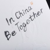
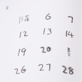
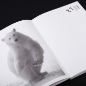
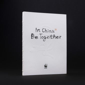
| DESIGN NAME: WWF Calendar PRIMARY FUNCTION: Promotion notebook INSPIRATION: From 1985 to 2016 WWF has been reaching the far corners of the country and now having its 35th anniversary. In 2017 for the new calendar design Nan Zhou used Chinese dye ink technique that brings the viewer unexpectedly in and out of reality. In China 2017 is the year of the rooster and has a meaning of great luck. The rooster significance reminded him of a picture he drew of a bird looking over its back in childhood. Slightly standing out from the cover this interesting memory is now left on the calendar cover. UNIQUE PROPERTIES / PROJECT DESCRIPTION: The calendar design is done in traditional Chinese way which includes the use of ink and calligraph. The special feature is the faint color of hieroglyphs that has a magical feeling of yin and yang. It brings a very special relaxed feeling to the whole design. Being accepted by WWF was unexpected as minimum explanations and comments was given for the design features. OPERATION / FLOW / INTERACTION: The WWF calendar notebook design used a traditional Chinese design feeling. Natural. Free digital writing. It contains reminders of the twenty-four solar terms 24 solar seasons, important environmental protection days, as well as used the most important action records of the volunteers. Thus making the calendar very practical and as well as having an indistinct pattern of beauty. PROJECT DURATION AND LOCATION: The project started in November 2016 and finished in December 2016. WWF started to use new calendar in January 2017 up to December 2017. |
PRODUCTION / REALIZATION TECHNOLOGY: The calender design is done in traditional Chinese way which includes the use of ink and calligraph. In 2017 for the new calendar notebook design Nan Zhou used chinese dye ink technique which has a magical feeling of yin and yang. It brings the viewer unexpectedly in and out of reality. The special feature is the faint color of hieroglyphs that brings a very special relaxed feeling to the whole design. Being accepted by WWF was unexpected as minimum explanations and comments was given for the design features. SPECIFICATIONS / TECHNICAL PROPERTIES: 160*215mm(h), thickness 12mm TAGS: Calendar, WWF, anniversary, calligraph, ink, Chinese, hieroglyphs, rooster, Yin and Yang RESEARCH ABSTRACT: WWF now having its 36th anniversary. Its main theme is In China be together. The calendar design with its traditional Chinese features was drawn by art director Nan Zhou. In 2017 for the new calendar design he used Chinese dye ink technique. The special feature is the faint color of hieroglyphs. In China 2017 is the year of the rooster and has a meaning of great luck. The rooster significance reminded him of a picture he drew of a bird looking over its back in childhood. It now embossed on calendar cover. CHALLENGE: The WWF calendar has been a continuing design challenge. Now its about how to improve over last year design and make the new one even better. Last year Nan Zhou used a dye ink technique which left white spaces to deliver a more direct comparison and create a more imaginary artistic conception. But this year is a new challenge for him. ADDED DATE: 2018-02-07 16:07:22 TEAM MEMBERS (2) : Art Diretor: Nan Zhou and Designer: Shubin Zhang IMAGE CREDITS: Image #1: Photographer Zhang Shubin, WWF, 2017. Image #2: Photographer Zhang Shubin, WWF, 2017. Image #3: Photographer Zhang Shubin, WWF, 2017. Image #4: Photographer Zhang Shubin, WWF, 2017. Image #5: Photographer Zhang Shubin, WWF, 2017. |
||||
| Visit the following page to learn more: http://www.wwf.org.za | |||||
| AWARD DETAILS | |
 |
Wwf Calendar Promotion Notebook by Nan Zhou and Shubin Zhang is Winner in Print and Published Media Design Category, 2017 - 2018.· Read the interview with designer Nan Zhou and Shubin Zhang for design WWF Calendar here.· Press Members: Login or Register to request an exclusive interview with Nan Zhou and Shubin Zhang. · Click here to register inorder to view the profile and other works by Nan Zhou and Shubin Zhang. |
| SOCIAL |
| + Add to Likes / Favorites | Send to My Email | Comment | Testimonials | View Press-Release | Press Kit |
Did you like Nan Zhou and Shubin Zhang's Print Design?
You will most likely enjoy other award winning print design as well.
Click here to view more Award Winning Print Design.


