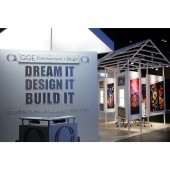
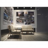
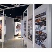
Hip Valley Lights Trade show booth by Beams Creative |
Home > Winners > #63566 |
 |
|
||||
| DESIGN DETAILS | |||||
| DESIGN NAME: Hip Valley Lights PRIMARY FUNCTION: Trade show booth INSPIRATION: The exhibit was an evolution of the company's gallery style of previous years, in which they used modular aluminium frames. We rotate the axis 45 degrees to create a singular path in and out of the front entrance instead of an entrance on each side, which was done in previous years. The client is known for their mid century designed theme parks, we put a modern take on a the popular hitched roof, along with a large white light to bring attention to the space. UNIQUE PROPERTIES / PROJECT DESCRIPTION: What makes the exhibit unique is its detailing in terms of placement of functional features. Besides the huge skylight signalling the entrance, there are steams and strips of light throughout the exhibit that add intrigue. We also made sure that every hanging light and wire were ran through the ceiling pipes, which kept the floor walking path spacious and clean. Lastly, we placed brochure stands inside of the walls so that there wasn't any added unnecessary moveable furniture. OPERATION / FLOW / INTERACTION: The exhibit was required to have four many meeting areas as the client initiates most of its business at exhibitions. Our design allowed users to travel throughout the booth, viewing the clients past work, on a singular path while not disturbing the three separate meeting areas. PROJECT DURATION AND LOCATION: The project was designed in August, 2017. It was displayed in Nov, 2017 in Orlando and will be displayed again in June 2018 in Hong Kong. |
PRODUCTION / REALIZATION TECHNOLOGY: This booth practices a sustainable method in which we build the parts to be easily assembled and disassembled for reuse purpose. However, we still maintained the custom look of high end exhibits. Because of the limitations of shipping containers, the entire booth is able to be broken down into 2 meter length portions. The wooden walls are snapped together using interlocks, while the roof are made in 1.5m triangular pieces that are bolted together. Because we know several different teams will have to construct the exhibit, we prepared an Ikea like installation manual. SPECIFICATIONS / TECHNICAL PROPERTIES: The plot of the exhibition is on a 9m x 9m space. The exhibit's roof reached up to 4m tall. TAGS: white, light, exhibition, booth, gallery, exhibit, roof, triangle, triangular RESEARCH ABSTRACT: As we had worked with this client before, we knew their tendency to want large walls and spotlights. Because we wanted to allow them to ship their exhibit around this time, we spend a lot of time experimenting ways to create barriers without necessarily creating walls. We experimented with several transparent walls that included using strings to hang the art, empty frames, and glass. In the end, some wall sizes were made shorter and placed on top of frames, while others walls were made of sheets of fabric, which all reduced weight and saved space during packing. CHALLENGE: The main obstacle if the project was making the roof in a way which can be broken down into parts, and yet still having the structural ability to sustain safety. The roof presented a specific problem. the solution was to use a heavier metal so that the roof, although supported by the walls it stood upon, also supported itself at the higher part of the hitches. ADDED DATE: 2018-01-31 10:15:38 TEAM MEMBERS (3) : Lead Designer: Donte Dandridge, Designer: Kent Cheuk and Project Manager: Judith Ngan IMAGE CREDITS: Beams Creative, 2017. PATENTS/COPYRIGHTS: Copyright belongs to Beams Creative, 2017 |
||||
| Visit the following page to learn more: http://beamscreative.com | |||||
| AWARD DETAILS | |
 |
Hip Valley Lights Trade Show Booth by Beams Creative is Winner in Interior Space and Exhibition Design Category, 2017 - 2018.· Read the interview with designer Beams Creative for design Hip Valley Lights here.· Press Members: Login or Register to request an exclusive interview with Beams Creative. · Click here to register inorder to view the profile and other works by Beams Creative. |
| SOCIAL |
| + Add to Likes / Favorites | Send to My Email | Comment | Testimonials | View Press-Release | Press Kit |
Did you like Beams Creative's Interior Design?
You will most likely enjoy other award winning interior design as well.
Click here to view more Award Winning Interior Design.


