Linkou Z House Residential Space by BeingDesign |
Home > Winners > #63564 |
 |
|
||||
| DESIGN DETAILS | |||||
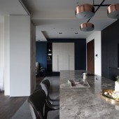
| DESIGN NAME: Linkou Z House PRIMARY FUNCTION: Residential Space INSPIRATION: The house owner was once the chief editor for a fashion magazine who still preserves the habits of reading and acquiring new knowledge after retirement. The owner expects to see the beautiful park views when lifting up the head and reading online at home. UNIQUE PROPERTIES / PROJECT DESCRIPTION: The original house construction was 4 rooms with 2 living space; where each room is independent that limits the areas of lighting from outside. The overall space is designed in X and Y axis with each axial dimension connecting to different relation. The X axis depicts the interaction between space and people, where the TV wall and the kitchen island serve as the visual focus. The Y axis describes the connection between space and natural,introducing lighting and greenness to the room. OPERATION / FLOW / INTERACTION: The reallocation of the movement defines the scope of different space within 100m2 so to satisfy the spatial requirement of all family members. Outside of each bedroom is a buffer space that maximizes the storage function. The overall space is designed in x and y axis with each axial dimension connecting to different relation. PROJECT DURATION AND LOCATION: The project started in May 2017 and finished in October 2017 in Linkou district, Taiwan. FITS BEST INTO CATEGORY: Interior Space and Exhibition Design |
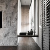
PRODUCTION / REALIZATION TECHNOLOGY: After understanding the needs of the owner, the designer analyzes the axial lines and creates an independent mass using the division of TV wall and structural wall, thereby introducing the cozy natural lighting into the space. The integration of work zone and dining table also meets the owner’s expectation to enjoy the beautiful views outside the window and live with the nature. SPECIFICATIONS / TECHNICAL PROPERTIES: 100m2 TAGS: Relationship between Axial Line and Mass, Connection between Design and Nature, Depth of Field, Structure RESEARCH ABSTRACT: The designer re-designs the spatial axis relationship explicitly on the movement and improves the inadequacy of lighting through spatial mass relationship. The use of imported rock-pattern system board in space hides the TV cabin. The dark-smear of wooden grille in the back is applied as the background of stability, highlighting the spatial level while depth of field re-extends to the white background wall in the back after opening the sliding grille door, which mutually drags with the mass to build more abundant layers. CHALLENGE: The original construction company designed the housing unit with four rooms, where each room is an independent space that limits the areas of lighting from outside.The designer detaches the original TV wall from the building structure to introduce outdoor lighting into the room, connecting the previous dining space with outdoor environment while extending the TV wall view into the bedroom. The light and suspended surface design of kitchen-island in the dining area has become the main focus. ADDED DATE: 2018-01-31 09:44:47 TEAM MEMBERS (1) : LO SHIH-CHENG IMAGE CREDITS: BeingDesign, 2017. |
||||
| Visit the following page to learn more: https://goo.gl/LihJym | |||||
| AWARD DETAILS | |
 |
Linkou Z House Residential Space by Beingdesign is Winner in Interior Space and Exhibition Design Category, 2017 - 2018.· Read the interview with designer BeingDesign for design Linkou Z House here.· Press Members: Login or Register to request an exclusive interview with BeingDesign. · Click here to register inorder to view the profile and other works by BeingDesign. |
| SOCIAL |
| + Add to Likes / Favorites | Send to My Email | Comment | Testimonials | View Press-Release | Press Kit |
Did you like Beingdesign's Interior Design?
You will most likely enjoy other award winning interior design as well.
Click here to view more Award Winning Interior Design.


