Hemin Office by 6070 Interior Design Ltd |
Home > Winners > #62628 |
 |
|
||||
| DESIGN DETAILS | |||||
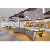
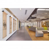
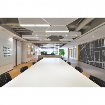
| DESIGN NAME: Hemin PRIMARY FUNCTION: Office INSPIRATION: I want to use a simple language in which everybody can understand. H have been used as key design element, and also represent client UNIQUE PROPERTIES / PROJECT DESCRIPTION: Hemin office is a Shanghai based property estate development company. We used “H” as the main design concepts. Three-dimensional logo wall, H-shaped ceiling feature, all developed from their name. Flexibility is the client’s mission. Therefore, an open area as reception linked with operable wall conference room is ideally for the space. It is very convenient to convert 2 spaces into separate area. OPERATION / FLOW / INTERACTION: By couple of times 3-D mock up, the H-shaped logo wall, lighting features getting in a very unique form. PROJECT DURATION AND LOCATION: the project started in June 2017 in Shanghai and finished in October FITS BEST INTO CATEGORY: Interior Space and Exhibition Design |
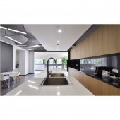
PRODUCTION / REALIZATION TECHNOLOGY: Limited budget is also the consideration of this project. White brick wall, re-used wooden board, metal mesh…etc, all resourced from local material market. Aims to save cost and time. We used re-cycled PVC flooring as main floor materials. Using metal mesh is our strong strength. By several times mock up, finally we got an unique-shaped ceiling features SPECIFICATIONS / TECHNICAL PROPERTIES: Korea PVC recycled flooring- 900mm x 180mm. TAGS: Good result take time, H means creative RESEARCH ABSTRACT: When we started to design Hemin office, we tried to find something not too over design, too much fancy details, easier understanding and realise its Hemin office! So we think to use H as the main concepts. H itself is not a typical square or circle shape, therefore we cannot use any diagram, we have to try many options to make it looks unique but also everyone knows its transformed from H. Once we have some ideas how to transform the H, we started to tinge the angles, then it becomes a flying H, more elegant and full of energy, its ideally to put this at staff area, feeling relax and significant CHALLENGE: Transform the H into meaningful shaped, also represents the client. Save cost, use materials carefully in terms of recycled, easy maintenance, user friendly ADDED DATE: 2017-12-14 04:31:23 TEAM MEMBERS (1) : Pan Mok, Ye Hai IMAGE CREDITS: Image 1/Pan Mok/Kimi Guan. Image 2/Pan Mok/Kimi Guan. Image 3/Pan Mok/Kimi Guan. Image 4/Pan Mok/Kimi Guan. Image 5/Pan Mok/Kimi Guan. |
||||
| Visit the following page to learn more: https://www.6070design.com | |||||
| AWARD DETAILS | |
 |
Hemin Office by 6070 Interior Design Ltd is Winner in Interior Space and Exhibition Design Category, 2017 - 2018.· Read the interview with designer 6070 Interior Design Ltd for design Hemin here.· Press Members: Login or Register to request an exclusive interview with 6070 Interior Design Ltd. · Click here to register inorder to view the profile and other works by 6070 Interior Design Ltd. |
| SOCIAL |
| + Add to Likes / Favorites | Send to My Email | Comment | Testimonials | View Press-Release | Press Kit |
Did you like 6070 Interior Design Ltd's Interior Design?
You will most likely enjoy other award winning interior design as well.
Click here to view more Award Winning Interior Design.


