ZHONGJING FINANCIAL CENTER Office by PleasantHouse |
Home > Winners > #62608 |
 |
|
||||
| DESIGN DETAILS | |||||
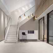
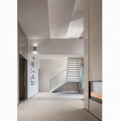
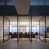
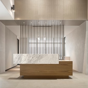
| DESIGN NAME: ZHONGJING FINANCIAL CENTER PRIMARY FUNCTION: Office INSPIRATION: The Project is seated in Shenzhen High-Tech Industrial Park, a start-up base at the forefront of the city. In the light of the booming, day-and-night bustling and fiercely competitive financial markets, the design team intends to create for businesses a simple, elegant and stylish office environment, where people involved feel refreshed and released from all stress amid the purely balanced atmosphere, enjoying pleasure even in work. UNIQUE PROPERTIES / PROJECT DESCRIPTION: When people create environment, the environment also makes people. The overall space manages to offer more relaxing and quiet and less flashy. It emphasizes the use of pure materials to reflect the taste and neat lines to broaden horizon, and banishes any complex decorative element. Dominant tone of pure white and plain wood brings about fresh and nature feelings. The combination of sunlight and transparent materials relieves the stress during work and creates an atmosphere of elegance. OPERATION / FLOW / INTERACTION: The design works not only to create interface and plan for the space, but also to allow people involved to benefit from the subtle influence from the environment. Hopefully, people can spare themselves some time from everyday competition, and enjoy the tranquility standing by the windows till the night. PROJECT DURATION AND LOCATION: The project started in August 2016 in Shenzhen and finished in February 2017. FITS BEST INTO CATEGORY: Interior Space and Exhibition Design |
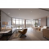
PRODUCTION / REALIZATION TECHNOLOGY: The vertical wooden grilles allow soft flow of shadows, implying a trace of Chinese flavor. The textured brass and luminaire elevates the temperature delivered by the design in details. The high-floor rest area has bright floor-to-ceiling windows overlooking the entire Park. Lemon yellow and peacock blue interspersed in the space spark the vitality and add poetic flavor and spice to the busy working atmosphere. SPECIFICATIONS / TECHNICAL PROPERTIES: 2,800 square meters TAGS: simplicity, elegance, pure, poetic, tranquility RESEARCH ABSTRACT: The property is located at the 24th and 25th floors of the building. Against the panoramic views, the original indoor space is structured in a seemingly cramped manner. After further considerations, the design team fully utilizes the interior partial raised space and two-sided sloped roof, and makes reasonable arrangement of flow for the plane layout. CHALLENGE: By managing the cadence with proportion and dividing views with lines, the office space is given with due harmony and order. ADDED DATE: 2017-12-13 03:49:56 TEAM MEMBERS (5) : Xie Fuji: Creative Director, Ye Ling: Project Manager, Guo Chunyang: Senior Interior Designer, Xia Lei: Interior Designer and Cui Jun: FFE Designer IMAGE CREDITS: Image #1: Photographer Yan Ming, Zhongjing Financial Centre , 2017. Image #2: Photographer Yan Ming, Zhongjing Financial Centre , 2017. Image #3: Photographer Yan Ming, Zhongjing Financial Centre , 2017. Image #4: Photographer Yan Ming, Zhongjing Financial Centre , 2017. Image #5: Photographer Yan Ming, Zhongjing Financial Centre , 2017. PATENTS/COPYRIGHTS: Copyrights belong to PleasantHouse Design, 2017 |
||||
| Visit the following page to learn more: http://www.pleasanthouse-china.com/ | |||||
| AWARD DETAILS | |
 |
Zhongjing Financial Center Office by Pleasanthouse is Winner in Interior Space and Exhibition Design Category, 2017 - 2018.· Read the interview with designer PleasantHouse for design ZHONGJING FINANCIAL CENTER here.· Press Members: Login or Register to request an exclusive interview with PleasantHouse. · Click here to register inorder to view the profile and other works by PleasantHouse. |
| SOCIAL |
| + Add to Likes / Favorites | Send to My Email | Comment | Testimonials | View Press-Release | Press Kit |
Did you like Pleasanthouse's Interior Design?
You will most likely enjoy other award winning interior design as well.
Click here to view more Award Winning Interior Design.


