Toujours Belle Presentation and Sales by David Chang |
Home > Winners > #61921 |
 |
|
||||
| DESIGN DETAILS | |||||
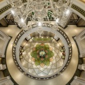
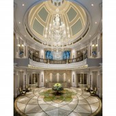
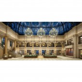
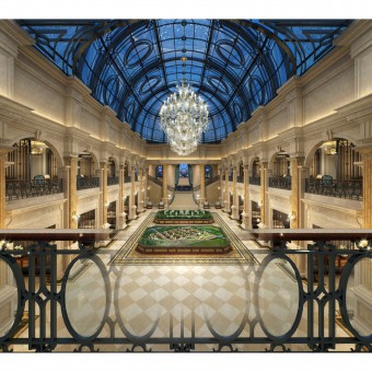
| DESIGN NAME: Toujours Belle PRIMARY FUNCTION: Presentation and Sales INSPIRATION: The design was inspired by the official art style of Napoleon reign, the Empire style, which is associated with the glory of Roman Empire where the grand and splendid architecture symbolized the majestic and expansive dominion of the empire. The rhythm in the space composes a heroic song of triumph, strong yet lyric, noble and proud, telling thrilling stories with brilliance. UNIQUE PROPERTIES / PROJECT DESCRIPTION: Zhengzhou Toujours Belle covers around 2.9 million square meters, including areas for experiencing international business streets, creative culture and international residence with elite social system, theme park, and a full-range of educational system, healthcare system and property management system, to create a top-notch model for comprehensive community. OPERATION / FLOW / INTERACTION: The application of lines, columns, carvings and the division follows the style of French court to integrate elegance into modern design, adding a touch of solemnness. French-style architecture pursues involvement in natural surroundings to create a large activity space. The project site model is positioned under a lifted ceiling with large arches and glass vault speaking for its magnificence, a combination of heroic splendor and lyrical euphemism. PROJECT DURATION AND LOCATION: Commencement: August 2014 Completion: October 2015 Location: Zhengzhou, China FITS BEST INTO CATEGORY: Interior Space and Exhibition Design |
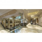
PRODUCTION / REALIZATION TECHNOLOGY: The detailing are prevalent in the grandeur: rare stones applied extensively create a holy and crystal feeling, while the leather, mirror and precious metal represent the spirit of a new era. The tonality set by white, gray, beige and other light colors exudes not only aristocratic calmness and gracefulness, but also the flourishing prosperity in the city. SPECIFICATIONS / TECHNICAL PROPERTIES: Total area: 2816 square meters Height: highest 16.4m, lowest 4m TAGS: Luxury, Design, Interior Design, Classical, Formal, Clubhouse, Sales Presentation RESEARCH ABSTRACT: We provided two proposals for the client: one classical French, the other modern French. They were differentiated by colors and lines: the former is more grey blue tone based and composed of spaces divided by curved lines, the other more green with linear divisions. In the end, based on the market and customer preferences, the client decided to adopt classical French style with some modern French elements, which rendered into what we see now. CHALLENGE: In the interior, we designed the high ceiling above the reception area and the corridor on the second floor to maintain smooth continuation and the dialogue among spaces. The biggest highlight of the whole building is the site model area, for which our proposal of the glass vault was accepted to replace the original flat glass roof, resonating well with the whole design style. ADDED DATE: 2017-10-08 20:53:08 TEAM MEMBERS (5) : Chief Design Director: David Chang, Designer: Jim Du, Designer: Nicole Wu, Designer: Xiaomin Li and Designer: Becky Sun IMAGE CREDITS: na PATENTS/COPYRIGHTS: Copyrights belong to David Chang Design Associates International, 2017 |
||||
| Visit the following page to learn more: http://www.dcida.com | |||||
| AWARD DETAILS | |
 |
Toujours Belle Presentation and Sales by David Chang is Winner in Interior Space and Exhibition Design Category, 2017 - 2018.· Read the interview with designer David Chang for design Toujours Belle here.· Press Members: Login or Register to request an exclusive interview with David Chang. · Click here to register inorder to view the profile and other works by David Chang. |
| SOCIAL |
| + Add to Likes / Favorites | Send to My Email | Comment | Testimonials | View Press-Release | Press Kit |
Did you like David Chang's Interior Design?
You will most likely enjoy other award winning interior design as well.
Click here to view more Award Winning Interior Design.


