Barnana x Starbucks Exclusive Packaging - Snacks by Nik Ingersoll |
Home > Winners > #61571 |
 |
|
||||
| DESIGN DETAILS | |||||
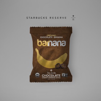
| DESIGN NAME: Barnana x Starbucks Exclusive PRIMARY FUNCTION: Packaging - Snacks INSPIRATION: Barnana's mission is to end food waste on banana farms by upcycling the bananas that usually go to waste on farms in Latin America. So far, Barnana has saved over 26 million bananas from going to waste with these products. They are USDA Certified Organic, Non GMO Project Verified and use Fair Trade Certified Ingredients. This was designed specifically for Starbucks and is sold nationwide in over 12,000 Starbucks stores in the USA. I wanted to design something unique for this channel of stores, a channel the brand had never been in before. UNIQUE PROPERTIES / PROJECT DESCRIPTION: This is a unique packaging to the Barnana brand which is typically characterized by bright, colorful elements. I needed thread the needle on hitting an exclusive, premium feel while making sure the brand was consistent across channels. In order to do just that, I used mixed materials for this package, something that I had not done before. Gold foil (silver foil with transparent yellow overlay to get a pure gold), silver foil, registered matte background, and gloss overlays. The way that the Starbucks stores lighting systems are laid out, this package shined in the snack section perfectly. This design is both unique to the Barnana brand and highly differentiated within Starbucks stores fitting with the Starbucks Reserve direction that they are moving towards. OPERATION / FLOW / INTERACTION: - PROJECT DURATION AND LOCATION: The project took about 8 months to complete and was done in Los Angeles, California over several cups of coffee and inspiration. FITS BEST INTO CATEGORY: Packaging Design |
PRODUCTION / REALIZATION TECHNOLOGY: Registered matte material with metalized cutaways and gloss overlays. The gold foil look is a metalized material with a golden color printed on top of it, giving it a gold sheen. SPECIFICATIONS / TECHNICAL PROPERTIES: 114mm Width x 25mm Depth x 127mm Height TAGS: packaging, package, bananas, sustainable, green, snacks, organic, RESEARCH ABSTRACT: Initially, we tested 4 different flavors in 2 different cohorts of Starbucks stores to see what sold the best. The two regions that were chosen were selected based on which stores would best simulate a national rollout with the Starbucks chain. Upon testing, the Organic Chocolate Chewy Banana Bites performed best. Further sensory testing was conducted using Facebook ads and targeting Starbucks customers to see which packaging varietals they liked the most. This confirmed my initial hypothesis in terms of overall look, feel and fit for that customer segment. CHALLENGE: The challenge was taking the Barnana brand which had been living in the natural/organic retail channels for it's entire existence and translate it into a premium coffee shop environment. With the absence of 1,000's of other packages next to ours, we would have a better chance to shine on shelf. Another challenge was the lighting in the stores. It is a bit dimly lit, but there is a nice light right above the snack tower. That's why the gold and silver foil concept exceeded my expectations when we put them in the snack towers. The film was premium and the way the light hit the foil on the packages, they lit up brightly. ADDED DATE: 2017-09-29 20:33:52 TEAM MEMBERS (1) : Nik Ingersoll IMAGE CREDITS: Nik Ingersoll PATENTS/COPYRIGHTS: Copyright Barnana 2017 |
||||
| Visit the following page to learn more: https://ingersollnik.com | |||||
| AWARD DETAILS | |
 |
Barnana X Starbucks Exclusive Packaging-Snacks by Nik Ingersoll is Winner in Packaging Design Category, 2017 - 2018.· Read the interview with designer Nik Ingersoll for design Barnana x Starbucks Exclusive here.· Press Members: Login or Register to request an exclusive interview with Nik Ingersoll. · Click here to register inorder to view the profile and other works by Nik Ingersoll. |
| SOCIAL |
| + Add to Likes / Favorites | Send to My Email | Comment | Testimonials | View Press-Release | Press Kit |
Did you like Nik Ingersoll's Packaging Design?
You will most likely enjoy other award winning packaging design as well.
Click here to view more Award Winning Packaging Design.


