Beagle Ship Website by Alisson Rochinski |
Home > Winners > #61446 |
 |
|
||||
| DESIGN DETAILS | |||||
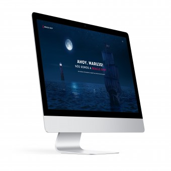
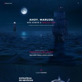
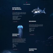
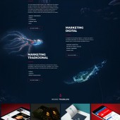
| DESIGN NAME: Beagle Ship PRIMARY FUNCTION: Website INSPIRATION: I have an experience and passion for 9 years design and this has generated me a good background in UI Design and Interactions. My main motivation for creating the website in this way was the lack of sites of advertising agencies with relevant content and an enjoyable user experience in Brazil. I was always a big fan of nature's perfection and wanted to make a site that was a bit more tactile, that gave me the idea of creating an immersive site with a sense of depth. UNIQUE PROPERTIES / PROJECT DESCRIPTION: The project was thought to be intuitive and provide a good user experience. The site, created for a Brazilian advertising agency, aims to provide an immersive navigation experience with a fast learning curve. The design was thought so that it could be animated by the programming, and that the user feels advancing in the depth of the sea as it navigates. The colors and fonts chosen were designed to be aligned with the company's identity and provide the feeling of credibility and a strong brand. OPERATION / FLOW / INTERACTION: The user enters and views the relevant information about the agency while absorbing the culture. The scrolling of the page happens at the same time that animations trigger, the anchor descends according to the scroll and for only the maximum depth of the sea. All elements were designed so that they could be animated and that the experience could be as intuitive as possible. PROJECT DURATION AND LOCATION: The project was started in March 2017 and finalized in September 2017 in Umuarama / Brazil. FITS BEST INTO CATEGORY: Interface, Interaction and User Experience Design |
PRODUCTION / REALIZATION TECHNOLOGY: For creating the site I used Adobe Photoshop and Adobe Illustrator to create some icons. I also used a Wacom Intuos support that helped me to create and edit the images. From the base of some wireframes it distributes the information of techniques of visual hierarchy to provide a light and pleasant experience that instigates curiosity. Also the color theory was taken into account so that the whole project could be in harmony. SPECIFICATIONS / TECHNICAL PROPERTIES: The design has 1920px wide by 8848 pixels in height, created in 300ppi and using RGB colors TAGS: Website, Interaction, Agency, Ocean, Immersive RESEARCH ABSTRACT: The process began in the first referral searches of outside sites that were highlighted and what were the characteristics that led these sites to be highlighted. Then I researched more about the oceans and especially the maritime environment so that past experience could be fully aligned with the company's strategies. From this were created wireframes that were later transformed into visual materials in Photoshop. CHALLENGE: The creative challenge was to create a quality and differentiated interface in Brazil that could attract audiences for the design and differentiated navigation experience that other public agencies in the country do not have. ADDED DATE: 2017-09-29 02:40:15 TEAM MEMBERS (1) : Alisson Rochinski IMAGE CREDITS: Ship image: Shutterstock Credits PATENTS/COPYRIGHTS: Copyrights belong to Beagle Ship, 2018 |
||||
| Visit the following page to learn more: http://www.rochinski.com | |||||
| AWARD DETAILS | |
 |
Beagle Ship Website by Alisson Rochinski is Winner in Website and Web Design Category, 2017 - 2018.· Read the interview with designer Alisson Rochinski for design Beagle Ship here.· Press Members: Login or Register to request an exclusive interview with Alisson Rochinski. · Click here to register inorder to view the profile and other works by Alisson Rochinski. |
| SOCIAL |
| + Add to Likes / Favorites | Send to My Email | Comment | Testimonials | View Press-Release | Press Kit |
Did you like Alisson Rochinski's Web Design?
You will most likely enjoy other award winning web design as well.
Click here to view more Award Winning Web Design.


