DESIGN NAME:
Kisseal Coffee
PRIMARY FUNCTION:
Beverage
INSPIRATION:
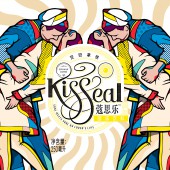
Shelley once said, soul meets soul on lover’s lips. And “sealed with a kiss” is a rather popular song. To express wordless love and its true essence, we reinterpret “sealed with a kiss” by illustrating the well-known kiss in Times Square happened in WWⅡ. Thus, we spread the idea that it is love that makes the world rotate, that love is most enduring emotion, that love is a part of the brand’s concept and that the brand will hopefully last for ever.
UNIQUE PROPERTIES / PROJECT DESCRIPTION:
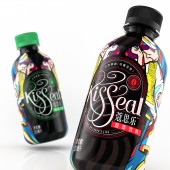
The name of Kisseal is from a pop song and every single letter is symbolized in the artwork into flowing shapes just like aroma of coffee.The illustration of the bottle is from 2 famous artists, Marco & Stefano, twin bothers from Turin Italy. Their inspiration is from stained glass window of churches and the style is Pop Art, which endows the package with a high identifiability and a strong feeling of aesthetics. As such, the graphic design conveys the core value of the brand effectively.
OPERATION / FLOW / INTERACTION:
Coffee is a beverage of both function and leisure. People drink it when they relax and work. So we try to make our product more distinctive. We combine the two popular themes of love and coffee together so as to build up a specific image of the brand. And we also mix the value of modern society and tradition culture with kiss, war, peace and coffee to remind people of how lucky we are to live in a peaceful world.
PROJECT DURATION AND LOCATION:
The project started from May 2017 and finished in September 2017.
The design is done in Shenzhen, proofing in Shanghai, production in Beijing.
FITS BEST INTO CATEGORY:
Packaging Design
|
PRODUCTION / REALIZATION TECHNOLOGY:
The plastic bottle is covered by shrink films and printed with the technique of spot-color printing.
SPECIFICATIONS / TECHNICAL PROPERTIES:
Diameter 57mm x Height 146mm
TAGS:
Tiger Pan, Non-Alcohol, Beverage, Coffee, Leisure Food, Package Design, Graphic Design, Illustration, Snowflake,Snow Beer
RESEARCH ABSTRACT:
This is a case in need of upgrade. The previous package is thought to be out-of-date. So our team had many meetings and research to figure out the market positioning and overall style. We then found out the product is customized for young people aged between 17 to 27,especially young ladies. Based on that, we named the product by Kisseal as young women pay much attention to love and romance at this stage of life. And we also make clear that the package and even the whole brand image should always be fashionable and stylish.
CHALLENGE:
To name the product is a pain in the neck to us as many of what we want is registered officially and possessed by others. So we spent much time and effort to name the product both in Chinese and in English.
ADDED DATE:
2017-09-27 04:01:01
TEAM MEMBERS (3) :
Designer:Tiger Pan, Illustrator: Van Orton Brothers(Italy) and Assistant: Yuxuan He
IMAGE CREDITS:
Tiger Pan, 2017.
|


