Sketchy Archy Cinema by CM Jao and Ken Cheung |
Home > Winners > #61062 |
 |
|
||||
| DESIGN DETAILS | |||||
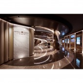
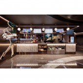
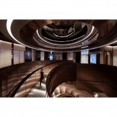
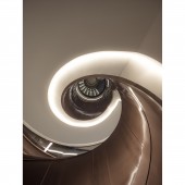
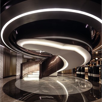
| DESIGN NAME: Sketchy Archy PRIMARY FUNCTION: Cinema INSPIRATION: Sketches are the first stage for the breed of ideas, a womb for creativity. Filmmakers prepare storyboards with detailed drawn scenes, frame by frame, showing the shooting angles, location, wardrobe and mood. These sketches are stunning just the way they are, but are often left unrecognized. Who says sketches can only stay in the first stage? Let’s bring them up front to the main stage and let them shine! Plain colours were used throughout the cinema to mimic the essence in sketching. Simple but patent, plain but bold, highlighted the authentic beauty of sketches. UNIQUE PROPERTIES / PROJECT DESCRIPTION: We imagined a lot of sketches of architectural plans were involved during this more than a century of time. Numerous sheets of paper, countless rounds of amendment, pencils and rubbers scattering on the working table… there goes the first stage of interior design as well as movies – the sketching stage. OPERATION / FLOW / INTERACTION: There are two lobbies in the cinema, one at the third floor and the other at the fourth floor. A whirlpool structure, a spiral staircase so to speak, was designed to connect the two floors, representing the pool of thoughts during brainstorming session, before sketches were even drawn on papers. One can walk on the staircase from third floor to the fourth floor. This whirlpool was made of black painted ceiling feature with concealed lighting, bronze bead blasting stainless steel with bronze hairline stainless steel trimming. Bronze metal mash, white painted surfaces and bronze hairline stainless steel balustrade were also used to construct the staircase. At both lobbies, black lacquered metal panels, wood veneer with nickel hairline stainless steel back counter, white marble featured wall and beige leather wall were also used. This combination of matt and shiny surfaces, use of light reflection helped to imitate different shades of pencil drawing. At the third floor food and beverage area, monotone was adopted, along with straight lines to further enrich the sketchy style. The counter was made of white stone with concealed lighting and bronze mirror skirting, with white steel countertop with dark pewter hairline stainless steel trimming. On the side, textured glass with dark pewter hairline stainless steel formed shapes of rectangle. On the inside, there are zigzag shaped grey tiles and sphere shaped lighting feature, bringing contrast to again, enhance the style of pencil sketches. Ascend through the whirlpool up to the fourth floor where another lobby and counter are, signage of different house numbers are indicated. Here, a more bronzy tone was adopted, slowing introducing the derivation of colours. The counter also featured with linear patterned white marbles and wood veneer back wall. Lines, curves, arcs, shapes, are the soul of sketches, and it is important to stress on them. PROJECT DURATION AND LOCATION: The project started in November 2016 in Hong Kong, and finished in October 2017. FITS BEST INTO CATEGORY: Interior Space and Exhibition Design |
PRODUCTION / REALIZATION TECHNOLOGY: - SPECIFICATIONS / TECHNICAL PROPERTIES: - TAGS: cinema, entertainment, public, leisure RESEARCH ABSTRACT: The Emperor Cinema sits in a building called ‘Entertainment Building’, which was completed in 1846 and was the first generation of the Hong Kong Club. The building itself has been serving as entertainment purposes ever since. In 1928, one of the first cinemas was constructed. Through the stream of time, the building had been alternated, demolished, reconstructed into different use; until now, the third generation in history, a cinema emerged once again. CHALLENGE: Throughout the whole cinema, lines and curves were located separately and independently, so as to speak for the exemption in freestyle sketching. Because sketch can speak for itself, and we wanted it to speak loud! ADDED DATE: 2017-09-25 09:50:24 TEAM MEMBERS (3) : CM Jao, Ken Cheung and Samantha Chan IMAGE CREDITS: Edmond Leung PATENTS/COPYRIGHTS: Copyrights belong to Oft Interiors Ltd., 2017 |
||||
| Visit the following page to learn more: https://www.oftinteriors.com | |||||
| AWARD DETAILS | |
 |
Sketchy Archy Cinema by Cm Jao and Ken Cheung is Winner in Interior Space and Exhibition Design Category, 2017 - 2018.· Read the interview with designer CM Jao and Ken Cheung for design Sketchy Archy here.· Press Members: Login or Register to request an exclusive interview with CM Jao and Ken Cheung. · Click here to register inorder to view the profile and other works by CM Jao and Ken Cheung. |
| SOCIAL |
| + Add to Likes / Favorites | Send to My Email | Comment | Testimonials | View Press-Release | Press Kit |
Did you like Cm Jao and Ken Cheung's Interior Design?
You will most likely enjoy other award winning interior design as well.
Click here to view more Award Winning Interior Design.


