DESIGN NAME:
SKYLINE
PRIMARY FUNCTION:
Residential House
INSPIRATION:
Considering the new space user is a single female and low privacy need, we implement Master Kisho Kurokawa‘s Grey Space by blurring the boundary and magnifying to extend the spatial feeling. The design allows the internal and external environments to communicate frequently and releases the residents’ souls. Therefore, the layout, flow, and updating of all the software and hardware have to undergo an overall renovation to meet the owner’s expectation for the future dwelling.
UNIQUE PROPERTIES / PROJECT DESCRIPTION:
In Taiwan, the old residences over 30 years located in the capital Taipei are generally exist the functional obstacles such as leaking, mildew, fragmentary compartment, poor lighting and ventilation. However, we tear down all of old layout to create an all-open space by actively arranging the connected windows on the light facing surface to introduce the sufficient lighting and fine air circulation to the residence, creating a modern style integrating affinity in delicacy and simplicity.
OPERATION / FLOW / INTERACTION:
-
PROJECT DURATION AND LOCATION:
-
FITS BEST INTO CATEGORY:
Interior Space and Exhibition Design
|
PRODUCTION / REALIZATION TECHNOLOGY:
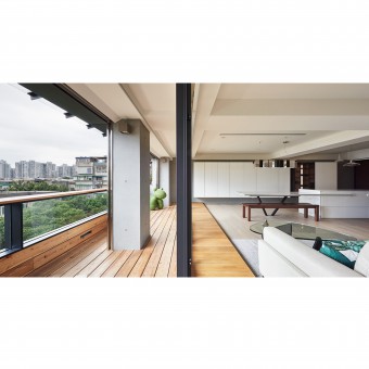
As for the balcony which was included in the interior space by the former owner, we return it with an even larger area to display the most beautiful skyline in the city through the lowered parapet. And the specially-made axis of the kitchen island connected with the dining table shapes the life colony with multiple functions.
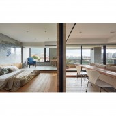
The original narrow three rooms are transformed into one main room used by the owner. The main bedroom is increased with such functional areas as elevated Japanese-room area, walk-in closet, and main bathroom. A wall gracefully separates the public and private fields.
SPECIFICATIONS / TECHNICAL PROPERTIES:
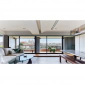
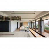
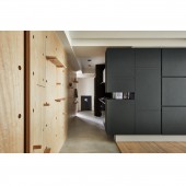
Widen balcony with the accordant wooden floor at the two sides of the sliding door forms an ambivalent space. Furthermore, we have the wide public space center on the axis of the marble table that is connected with the kitchen island. To maintain the visual clearance, all cabinets against the wall and the style of the wall in the same color tone which seamlessly integrate the mass into the background to make the heaven, earth and wall are composed of the sophisticated lines. The comfortable feeling that is neither too fast nor too slow is particularly rare and precious.
TAGS:
Interior, Design, House, Residence, Simple, Bright, Usability, modern
RESEARCH ABSTRACT:
Considering the new space user is a single female and low privacy need, we change all old layout to make this old house an real life-oriented space design, and also to satisfied both functional and beauty demand while avoiding the sensory interference and burden.
CHALLENGE:
-
ADDED DATE:
2017-09-25 07:47:00
TEAM MEMBERS (1) :
Designer: Armin Cheng
IMAGE CREDITS:
Hey! Cheese Photography Studio
|


