Causeway Education Centre Institution by Enoch Hui |
Home > Winners > #60632 |
 |
|
||||
| DESIGN DETAILS | |||||
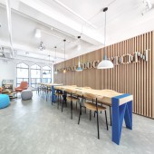
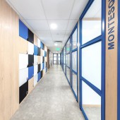
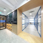
| DESIGN NAME: Causeway Education Centre PRIMARY FUNCTION: Institution INSPIRATION: Budget is one of the biggest concerns in this project, hence a minimal design approach is appropriate with one or two areas as focal points to draw student's attention of the school brand, with a touch of the school corporate color "blue" in certain details and mainly with white and light wood veneer for the entire space to give a cosy mood. UNIQUE PROPERTIES / PROJECT DESCRIPTION: Studying in Hong Kong is very competitive due to the lack of academic institution and therefore, student learning centre is quite common locally in Hong Kong, providing an extra prep time for a better preparation of exams and assignments for the local students out of the school hours. Typically the design of the learning centres look commercialized fully decorated with teachers posters and graphics wrapping all around the space, contrarily the client was expecting for something cosy and relax. OPERATION / FLOW / INTERACTION: The first experience while entering a space is always important; we aimed to sacrifice a huge space for the reception plus waiting area and tuck shop to let the students hanging around before or after class, a long study table is also located at the waiting area for some homework or internet surfing. There are totally 11 classrooms and each of the classrooms named with eminent person such as Einstein, Newton and Aristotle etc. The classrooms are all visible from the corridor through the glass partition with blue metal frameworks. A series of lockers are located along the corridor for the student’s use, they are designed with the corporate colour scheme of blue, wood, black and white. PROJECT DURATION AND LOCATION: The project started in April 2017 in Hong Kong and finished in June 2017 in Hong Kong. FITS BEST INTO CATEGORY: Interior Space and Exhibition Design |
PRODUCTION / REALIZATION TECHNOLOGY: Due to the limited time of the project, we created a module steel framework partition applying to all the classrooms in order to shorten the on site construction time. Also, we maintained part of the existing false ceiling panels in order to save the budget and time. The main materials used are blue powder coated metals, light oak wood and light grey vinyl flooring. The blue color appears in all details to reflect the institute corporate color scheme with a cosy, young and relax touch of light wooden material as background. SPECIFICATIONS / TECHNICAL PROPERTIES: The size of the project is approximately 4000 sq.ft. TAGS: Education Centre, Education Centre Design, Budget, Minimalism, Institution Project, Institution Design. RESEARCH ABSTRACT: Typically the design of the learning centres in Hong Kong look commercialized fully decorated with teachers posters and graphics wrapping all around the space, contrarily our aim was to create a clean and cosy space for the students and teachers to give another definition of professionalism on teaching in Hong Kong. CHALLENGE: The biggest challenge of this project is the limited time, the entire design and construction time were limited to one month including the drawings approval by the management office and client. The only way was to concentrate design in certain area as focal points. ADDED DATE: 2017-09-19 12:04:33 TEAM MEMBERS (5) : Director: Enoch Hui, Interior Designer: Mow Yung, Interior Designer: Joejie Durano, Interior Designer: Sammy Yu and Interior Designer: Marcus Cheung IMAGE CREDITS: Image #1: Photographer Nick Liu, Variations, 2017. Image #2: Photographer Nick Liu, Variations, 2017. Image #3: Photographer Nick Liu, Variations, 2017. Image #4: Photographer Nick Liu, Variations, 2017. Image #5: Photographer Nick Liu, Variations, 2017. PATENTS/COPYRIGHTS: Copyrights belong to Enoch Hui, 2017. |
||||
| Visit the following page to learn more: http://www.ateliere.com.hk/projects/othe |
|||||
| AWARD DETAILS | |
 |
Causeway Education Centre Institution by Enoch Hui is Winner in Interior Space and Exhibition Design Category, 2017 - 2018.· Read the interview with designer Enoch Hui for design Causeway Education Centre here.· Press Members: Login or Register to request an exclusive interview with Enoch Hui . · Click here to register inorder to view the profile and other works by Enoch Hui . |
| SOCIAL |
| + Add to Likes / Favorites | Send to My Email | Comment | Testimonials | View Press-Release | Press Kit |
Did you like Enoch Hui's Interior Design?
You will most likely enjoy other award winning interior design as well.
Click here to view more Award Winning Interior Design.


