DESIGN NAME:
TM Liquor Packaging
PRIMARY FUNCTION:
Packaging
INSPIRATION:
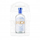
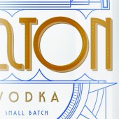
The direction incorporates elements from both the past and the present. Typography was chosen as the leading component to be featured. Type and its graphics were inspired by the city’s grand architecture: the medieval church, and the art deco style building.
Its approachable upright script type treatment paired with art deco illustration, adding a fresh color palette that gave the brand modern feel .
UNIQUE PROPERTIES / PROJECT DESCRIPTION:
Broker’s is a new product line of T&M Liquor Company based in London, UK. The company prides itself on selling one of the highest qualities of Rum, Vodka, and Gin. Its tradition, culture, and heritage are as important as it’s distinct taste.
OPERATION / FLOW / INTERACTION:
-
PROJECT DURATION AND LOCATION:
The project started in June 2017 in New York City and finished in August 2017.
FITS BEST INTO CATEGORY:
Packaging Design
|
PRODUCTION / REALIZATION TECHNOLOGY:
-
SPECIFICATIONS / TECHNICAL PROPERTIES:
700ML
TAGS:
Typography/Illustration
RESEARCH ABSTRACT:
I studied the broad spectrum of the different types of architecture: the medieval church, and the art deco style building.
CHALLENGE:
One of the challenges was the design of the labels since they had to communicate the design of typography and illustrations both individually and as a collective. To enhance the visualization of the contemporary personality, I chose bright and funky color palette makes for an eye-catching bottle design.
ADDED DATE:
2017-09-17 21:47:31
TEAM MEMBERS (1) :
IMAGE CREDITS:
Zhaoyi Wang, 2017.
|


