Owl Currency Exchange rate viewer by Hongseon Kim |
Home > Winners > #60504 |
 |
|
||||
| DESIGN DETAILS | |||||
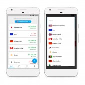
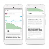
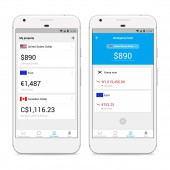
| DESIGN NAME: Owl Currency PRIMARY FUNCTION: Exchange rate viewer INSPIRATION: Exchange rates are important for travelers, immigrants, foreign students and businessmen. In order to meet various needs, an app for exchange rates would be multifunctional and complex. The Owl Currency is a simple yet multifunctional converter. The app's logo is an owl. The owl is awake while people sleep. The Owl Currency is a reliable app everytime. UNIQUE PROPERTIES / PROJECT DESCRIPTION: The more functions, the more complex it becomes. However The Owl Currency is easy, because the complex configuration has been hidden as much as possible. If users need a complex configuration, they can find it easily. Each configuration button has a Chevron mark. The app has a lot of functions to satisfy various needs or users. And each page of each menu has its own unique layout. So users don't get confused with the other menus. Finally, the Owl Currency can be still simple although it has multifunction. OPERATION / FLOW / INTERACTION: Each function is listed one by one in the tab bar below. Each of them is Exchange Rate, Currency Converter, My Property and Exchange rate alarm. Touch the menu to display the corresponding page. To set up advanced configurations, find a Chevron mark and touch it. Every page is organized in a different layout, and we focused on preventing confusion with other pages. PROJECT DURATION AND LOCATION: The design started in June 2017 and ended in July 2017 in Seoul, Korea. Development began at the same time as designing in June 2017 and ended in July 2017 in Vancouver, Canada. This app was released at Google Play in July 2017. |
PRODUCTION / REALIZATION TECHNOLOGY: Sketch 3 SPECIFICATIONS / TECHNICAL PROPERTIES: Android App TAGS: UX, UI, App, Application, android, Currency, Converter, Finance, owl currency RESEARCH ABSTRACT: The meaning of the color differs from country to country. For example, in the US, the color of rising price is green and the color of falling price is red. But in Korea, the color of rising price is red, and the decline is blue. The meaning of red is exactly the opposite. So It had to be taken care of localizing the app. CHALLENGE: The design was made in Seoul, Korea while it was developed in Vancouver, Canada. It was important to share each other's opinions. Because there are time difference between the designer and the developer. ADDED DATE: 2017-09-17 09:04:41 TEAM MEMBERS (2) : Designer: Hongseon Kim and Developer: Duhyun Kim IMAGE CREDITS: Hongseon Kim PATENTS/COPYRIGHTS: Hongseon Kim |
||||
| Visit the following page to learn more: http://goo.gl/7y4rSN | |||||
| CLIENT/STUDIO/BRAND DETAILS | |
 |
NAME: HongSeon Kim PROFILE: HongSeon Kim is a UI designer in Seoul, Korea who majored in media design and has been doing UI design for over 5 years. |
| AWARD DETAILS | |
 |
Owl Currency Exchange Rate Viewer by Hongseon Kim is Winner in Mobile Technologies, Applications and Software Design Category, 2017 - 2018.· Read the interview with designer Hongseon Kim for design Owl Currency here.· Press Members: Login or Register to request an exclusive interview with Hongseon Kim. · Click here to register inorder to view the profile and other works by Hongseon Kim. |
| SOCIAL |
| + Add to Likes / Favorites | Send to My Email | Comment | Testimonials | View Press-Release | Press Kit |
Did you like Hongseon Kim's Mobile Design?
You will most likely enjoy other award winning mobile design as well.
Click here to view more Award Winning Mobile Design.


