Okhota Strong Beer Packaging by Uniqa Creative Engineering |
Home > Winners > #60301 |
 |
|
||||
| DESIGN DETAILS | |||||
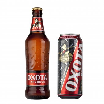
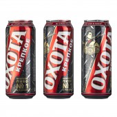
| DESIGN NAME: Okhota Strong PRIMARY FUNCTION: Beer Packaging INSPIRATION: The new masculine packaging design of Okhota Strong beer is based on the idea of communicating its high ABV via an easily recognizable symbol of the man's world: corrugated metal sheet. It is strongly associated with typical masculine activities that the target audience is familiar with. Metal is strong and firm just like the beer itself. The distinctive graphic pattern is associated with hard work, strength and masculinity. This corrugated metal speaks to the target consumer, provokes correct associations and strengthens emotional connection with the brand. UNIQUE PROPERTIES / PROJECT DESCRIPTION: Basic idea of Okhota Strong beer redesign is to show its high ABV through visually recognizable and firm material – corrugated metal. Corrugated metal becomes the main motif for bottle embossing, making it tactile and easy to hold. Graphic pattern resembling corrugated metal is transferred onto the aluminum can complemented by a scaled-up dynamic brand logo and modernized hunter illustration, which has been brand mascot for the last 5 years. Bold colors and chunky design elements link bottle and can together while appealing to the target working-class male audience. OPERATION / FLOW / INTERACTION: Unique embossing on the bottle made ensures tactile interaction with consumer and makes the bottle easier to hold. PROJECT DURATION AND LOCATION: The project was executed in 2016 in Moscow, Russia. FITS BEST INTO CATEGORY: Packaging Design |
PRODUCTION / REALIZATION TECHNOLOGY: Glass bottle is embossed with corrugated metal pattern. The same pattern is graphically imitated on aluminum can. SPECIFICATIONS / TECHNICAL PROPERTIES: Standard 0,5 ml can Standard 0,5 ml glass bottle TAGS: beer, redesign, embossing, metal pattern, tactility RESEARCH ABSTRACT: The redesign was triggered by the results of consumer behavior research and decreasing sales. According to the results of in-house consumer behavior research, target audience would establish stronger emotional connection with the brand if it emphasized masculinity. Hence, the imitation of corrugated metal, bold rough colors and more modern interpretation of the logo. CHALLENGE: Idea to redesign Okhota Strong beer was based on decrease in customers' interest to the brand combined with active sales growth of similar beer brands, which boasted modern and bold packaging design. In course of work client imposed serious restrictions: the logo had to stay intact together with the image of hunter as it assured brand recognition and was featured in marketing materials. Illustration got slightly modernized in the new design by making his clothes more detailed. Besides being challenged to interweave the hunter character and new design, we faced the necessity to carefully coordinate the creative process with production facilities as corrugated metal pattern on glass needed flawless execution. ADDED DATE: 2017-09-13 11:30:22 TEAM MEMBERS (1) : Uniqa Creative Engineering IMAGE CREDITS: Uniqa Creative Engineering, 2017. |
||||
| Visit the following page to learn more: http://bit.ly/2fjVXgu | |||||
| AWARD DETAILS | |
 |
Okhota Strong Beer Packaging by Uniqa Creative Engineering is Winner in Packaging Design Category, 2017 - 2018.· Read the interview with designer Uniqa Creative Engineering for design Okhota Strong here.· Press Members: Login or Register to request an exclusive interview with Uniqa Creative Engineering. · Click here to register inorder to view the profile and other works by Uniqa Creative Engineering. |
| SOCIAL |
| + Add to Likes / Favorites | Send to My Email | Comment | Testimonials | View Press-Release | Press Kit | Translations |
Did you like Uniqa Creative Engineering's Packaging Design?
You will most likely enjoy other award winning packaging design as well.
Click here to view more Award Winning Packaging Design.


