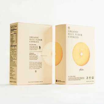
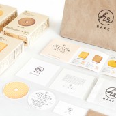
H and Bake Brand identity and packaging design by Schema, inc. |
Home > Winners > #59703 |
 |
|
||||
| DESIGN DETAILS | |||||
| DESIGN NAME: H and Bake PRIMARY FUNCTION: Brand identity and packaging design INSPIRATION: The concept of the brand is to get closer to the nature, and to let people who are gluten intolerance to enjoy the tasty cookies without holding back. The h in our name represents healthy, handmade, warmth from hands, caring from home, and many other meanings. For this series, we offer a better snack option to help you avoid complications with delicious and none allergy concern cookies. These sugar-free cookies are made of organic brown rice, to help people pay more attention to their health. UNIQUE PROPERTIES / PROJECT DESCRIPTION: To show the purity of the product, we placed the images of our products directly onto the packaging, and removed the unnecessary information to simplify the design. We also put a lot of thought on the typeface and colors for the design, because our product is made of non-artificial ingredients, it is natural and healthy for everyone. We want our customers to get the concept of the brand by just seeing our packaging designs. We want everyone to enjoy healthy snacks without holding back! OPERATION / FLOW / INTERACTION: The concept of the design came up with the original intention of the founders of the company, with all the good purposes of making a healthier snacks option for people, we want everyone to learn more about the meaning behind their brand, h&. H in the name represents healthy, handmade, warmth from hands, caring from home, and the & mark represents the possibilities are unlimited. h& could be a healthier option for people with diabetes, but it could also be a better option to anyone. PROJECT DURATION AND LOCATION: This project started in May 2015 in Taipei, Taiwan. The whole project took a year to finish the design for both brand identity and packaging design. This design is also honored to be awarded by Red Dot Communication Design in 2016. FITS BEST INTO CATEGORY: Packaging Design |
PRODUCTION / REALIZATION TECHNOLOGY: Our client wanted to let people with diabetes and other health concerns to enjoy cookies and snacks without holding back when they founded the company. With the new series of their products, they opened up a new field in healthy snacks industry with gluten-free products in Taiwanese market. With all the good purposes of developing a new snacks option, we want customers from all over the world to learn more about their love and the warmth of their original intention. Therefore, h& was born. SPECIFICATIONS / TECHNICAL PROPERTIES: Dimension of the package : H18cm* L12cm*W5cm TAGS: gluten free, organic, healthy, natural, simple, no additives, sugar free RESEARCH ABSTRACT: From knowing nothing about gluten-free to finishing the concept and the design of the brand, we did put a lot effort in the research to learn more about gluten-free, why is it important, and why people needs it. In addition, we took similar products from other markets as reference as well. From analyzing existing designs and the research we have done, our conclusion and our design was made. CHALLENGE: Except from knowing less about market demand of gluten-free products, how to persuade our client to removed the unnecessary information and extra decoration on the package and to simplify the design was the biggest challenge for us. But while considering the target market of the product is Western countries, where people are familiar with similar kinds of product and have been consuming for years, how to stand out from other well-known brands became our goal and we compromised with the design. ADDED DATE: 2017-08-30 06:27:02 TEAM MEMBERS (4) : Project Producer : Hirohiko Shiren, Project Director : Ko Lin, Design : Ai Honma and Copywriting : Chia Ling Chang IMAGE CREDITS: Schema, inc., 2017. |
||||
| Visit the following page to learn more: http://llschema.com/ | |||||
| AWARD DETAILS | |
 |
H and Bake Brand Identity and Packaging Design by Schema, Inc is Winner in Packaging Design Category, 2017 - 2018.· Read the interview with designer Schema, inc. for design H and Bake here.· Press Members: Login or Register to request an exclusive interview with Schema, inc.. · Click here to register inorder to view the profile and other works by Schema, inc.. |
| SOCIAL |
| + Add to Likes / Favorites | Send to My Email | Comment | Testimonials | View Press-Release | Press Kit |
Did you like Schema, Inc's Packaging Design?
You will most likely enjoy other award winning packaging design as well.
Click here to view more Award Winning Packaging Design.


