Supermarket Therapy Organizer areas by Hong Kong Trade Development Council |
Home > Winners > #59618 |
 |
|
||||
| DESIGN DETAILS | |||||
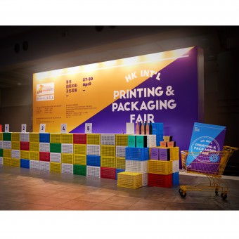
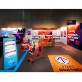
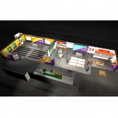
| DESIGN NAME: Supermarket Therapy PRIMARY FUNCTION: Organizer areas INSPIRATION: Inspiration to uplift the image of this trade fair came from the trade fair organizer requirement to provide an eye catching design to distinguish itself from the other participants. With this challenge and by researching a plethora of environments that relates to this industry, we decided recreate a surrealistic supermarket environment under the theme of Supermarket Therapy. Making use of bold colours to differentiate each zone and capture the visitors’ attention. UNIQUE PROPERTIES / PROJECT DESCRIPTION: A cost effective solution to uplift the organiser’s overall decorative ambience at the 2017 edition of the Hong Kong International Printing & Packaging Fair was required by the fair organiser. The areas included a 6m wide x 3.5m high registration wall with counter, an open forum, a print awards and digital printing awards areas, along with a separate seminar space to seat 100 people. OPERATION / FLOW / INTERACTION: The flow was important and the registration counter was our opportunity to provide a glimpse into the rest of the fair organiser’s design work. Once inside the exhibition hall, the attendees can easily locate the organisers’ multi-functional space which carries on the Supermarket Therapy concept. The organiser’s design work was a contribution to heighten the overall image for this edition of the HK Printing & Packaging Fair. PROJECT DURATION AND LOCATION: The project duration was 3 months from initial briefing to onsite completion. It was located at the Asia World Expo in Hong Kong and the event ran for 4 days starting from the 27th to 30th of April, 2017. The onsite set up was only 3 days. |
PRODUCTION / REALIZATION TECHNOLOGY: Due to budget constraints and our objective to avoid using heavy wooden structure, all the walls and backdrop were built with lightweight reusable aluminium systems cladded with stretched graphic vinyl. Biodegradable carpets were also used for the supermarket themed functional spaces. All of our props were hired to ensure our objective to reduce on-site waste was achieved. SPECIFICATIONS / TECHNICAL PROPERTIES: Following the Supermarket Therapy concept, our 6m long registration counter was made from reusable exhibition system with foam board graphic. Inside the 356m2 area for used the open forum, a print awards and digital printing awards areas, along with a separate seminar space to seat 100 people, all of the walls were built with lightweight reusable aluminium systems cladded with stretched graphic vinyl. Biodegradable carpets were also applied along with readily available hired propping. TAGS: Trade, Hong Kong, Printing, Packaging, Installation, Organiser Space, Exhibition, HKTDC, Design, Trade, Fair RESEARCH ABSTRACT: By analysing the importance of how printing & packaging plays an important role in various retail environments and modern culture our intentions were to replicate a supermarket environment. This was to play on the idea of the ubiquitous side of this industry. The Supermarket Therapy concept also provided a methodology to differentiate the various activities of the organiser’s spaces with the use of bold colours. CHALLENGE: The most challenging part was finding the right design concept that could add some fun to the experience of this trade fair compared to previous years. After analysing a proliferation of retail environments it was concluded that the supermarket would be the best fit to cover the many aspect of organiser’s brief both functionally and aesthetically in a cost effective manner. ADDED DATE: 2017-08-25 02:09:58 TEAM MEMBERS (9) : Jason Cheung, Dury Chin, Eddie Chak, KK Cheung, Sheena Fung, Cherry Chan, Jacob Lee, Rita Ho and Amies Sit IMAGE CREDITS: Hong Kong Trade Development Council |
||||
| Visit the following page to learn more: http://www.hktdc.com/ | |||||
| AWARD DETAILS | |
 |
Supermarket Therapy Organizer Areas by Hong Kong Trade Development Council is Winner in Event and Happening Design Category, 2017 - 2018.· Read the interview with designer Hong Kong Trade Development Council for design Supermarket Therapy here.· Press Members: Login or Register to request an exclusive interview with Hong Kong Trade Development Council. · Click here to register inorder to view the profile and other works by Hong Kong Trade Development Council. |
| SOCIAL |
| + Add to Likes / Favorites | Send to My Email | Comment | Testimonials | View Press-Release | Press Kit |
Did you like Hong Kong Trade Development Council's Event Design?
You will most likely enjoy other award winning event design as well.
Click here to view more Award Winning Event Design.


