DESIGN NAME:
The Orchards
PRIMARY FUNCTION:
Residence
INSPIRATION:
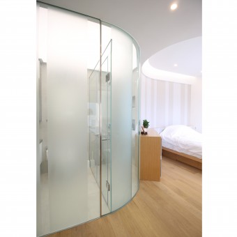
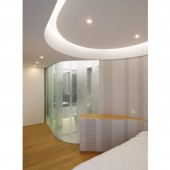
The design was inspired by the idea of having a strong element that defines the charater of the flat and at the same time addresses the client's requirement of having unobstructed space. We then came up with a snaky line that runs across the room. It sets out the bathroom and the spaces around it. A stretched ceiling, a U-shaped light trough and furniture items all came into place which further enhances the design.
UNIQUE PROPERTIES / PROJECT DESCRIPTION:
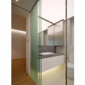
The design of this residential interior project is an experiment to define domestic spaces by lights, shapes and proportions. A brightly lit bathroom is created to become a centerpiece which sets the drama for the flat. It seamlessly connects the living room and the bedroom and offers a unique shower space. All the built elements are well integrated to enhance the living experience.
OPERATION / FLOW / INTERACTION:
The design offers great improvement to the original layout in terms of circulation and spatial experience. The barriers between living room and kitchen, living room and bedroom have been eliminated. A smooth connection between living room and the bedroom is highly appreciated by the client. It gives her the kind of freedom she was expecting. Sliding doors make the use of space more flexible and offer maximum degree of openness when required. Ample storage space is provided in built-in cabinets around the kitchen and the closet area.
PROJECT DURATION AND LOCATION:
The project started in June 2015 and finished in Febrary 2016. It is located in Hong Kong.
FITS BEST INTO CATEGORY:
Interior Space and Exhibition Design
|
PRODUCTION / REALIZATION TECHNOLOGY:
Once the layout and the rendered images had been approved by the client, we started to produce construction drawings. We used construction drawings and 3D images to communicate with the builders. Adjustment on site during installation was also a critical step to ensure the quality of the finished product.
All built-in furniture items were factory made and installed on site to achieve better finish quality, as well as to reduce noise and dust pollution on site. The bathroom enclosure is a combination of curve and flat glass panels with frosted stripes. Plasterboards were used on all false ceilings except the one inside the bathroom where a stretch ceiling with LED strips above were installed. In order to create a more natural outlook we used waxed oak flooring throughout the living room and the bedroom and large size concrete texture tiles in the bathroom.
SPECIFICATIONS / TECHNICAL PROPERTIES:
The flat has a floor area of 50 square meters.
TAGS:
residential, bathroom, light, curve, transparency
RESEARCH ABSTRACT:
Many layout options had been developed and tested in 3D modeling. The curvy bathroom layout was a breakthrough and it provides a successful alternative for similar type of residential projects. Sectional drawings also played a very important part in the design process when we integrated air conditioning unit, lighting and sliding door details into the void above the stretch ceiling.
CHALLENGE:
In order to achieve the desired effect a lot of effort was spent resolving the junction details where the stretched ceiling, the sliding glass door, the curve panels and the U-shaped light trough all coming together.
ADDED DATE:
2017-08-23 09:26:33
TEAM MEMBERS (1) :
Anthony Lei
IMAGE CREDITS:
Image #1 Photographer Daniel Y.K. Chan
Image #2 Photographer Daniel Y.K. Chan
Image #3 Photographer Daniel Y.K. Chan
Image #4 Photographer Daniel Y.K. Chan
|


