Rou by T Ham Concept store by WZWX architecture group |
Home > Winners > #59382 |
 |
|
||||
| DESIGN DETAILS | |||||
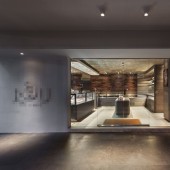
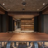
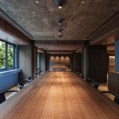
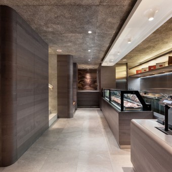
| DESIGN NAME: Rou by T Ham PRIMARY FUNCTION: Concept store INSPIRATION: The client wanted to create a new meat concept store, one that contains the best of traditional Asian wet-market butchery (friendly butchers who recommend cuts and perform the cutting, clients able to select particular cuts of meat), and the best of supermarket meat stalls (hygienic, comfortable interior with clear product labeling). The store would have the butchery/meat shop downstairs, with a multipurpose space for tastings, dining and other events upstairs. Our design challenge was to create a space that defines a new meat store and unify these functions. Our design concept is derived from the refrigerator, a machine which keeps food fresh. Rounded forms, curved corners, and customized lights of the fridge interiors inspire a set of formal vocabulary. UNIQUE PROPERTIES / PROJECT DESCRIPTION: In the 1F butchery/meat store, raw and cooked meats were allocated to opposing sides for hygiene control, with the shop's center taken up by a large fridge displaying premier meat items, while concealing the staircase behind. The back of house and gift wrapping station were pushed to the back. Sleek, easy-to-clean, stainless steel counters line the length of both raw and cooked meat counters, with custom-made refrigeration units beneath counters. Additional storage units were hidden inside display islands and columns. A combination of wood veneers, fibrous cement boards, sand stone tiles was used to keep the ambiance natural and comfortable. Grey veneer gives the downstairs “fridge” space a cooler tone, while warmer coloured woods such as stained walnut and Chinese parasol tree adorn upstairs, giving the upstairs restaurant/multi-pur OPERATION / FLOW / INTERACTION: - PROJECT DURATION AND LOCATION: Design from Nov 2016- Apr 2016. The store opened on 30 Apr 2016. FITS BEST INTO CATEGORY: Interior Space and Exhibition Design |
PRODUCTION / REALIZATION TECHNOLOGY: Interior material palette: wood veneers (ash, Chinese parasol, and walnut trees, some are stained to get the colour we wanted), recycled wood and concrete boards (Diacrete), sand stone tiles and granite stone (used in two feature walls on 1F meat shop, cut in two directions, one wall conveys a pattern of meat fibers, another the “marbling” of fat in meat). Special customized “volcano” lights: designed light fixtures are expensive, so we custom designed and made our own lights to fit the space, which worked out to be cheaper than buying from designer brands, and fits the space better. SPECIFICATIONS / TECHNICAL PROPERTIES: 1F 115 sq. m, 2F 235 sq. m TAGS: ROU, meat shop, T-HAM, WZWX, WZWX architecture group, restaurant, Richard Wang RESEARCH ABSTRACT: We had in-depth discussions with the client’s meat factory manager and their seasoned butchers, regarding the materials, ergonomic dimensions, and operating habits of their butchers, as well as drainage and cleaning requirements throughout the design of the meat operation counters. We changed one of our initial proposal to use tiles for the counters (to invoke a traditional sense of the butchery), but this was over turned by the manager, as the climate in Taipei will quickly produce molds in the mortar gaps of tile surfaces. In the end, we switched to use stainless steel for all the operating areas to ensure the ease of cleaning and maintaining hygiene. CHALLENGE: Challenges to create a spatial identity: the client (T-HAM) is a 50 year old meat production company with traditional values and old fashioned brand image. They wanted to use this new venture as an opportunity to create a new independent brand image in order reach out to new customers, and start a new outlet to sell new products. Our design challenge was how do we do it? How do we create a high quality meat shop and dining space that matches the company status and values? Additional spatial challenges include: 1F butchery/meat store: The floor plan had to a) separate the shop area for raw and cooked meats for hygiene reasons, and b) work around an existing staircase which had to be retained due to cost and time constraints. A space for back of house (for meat preparation and storage), lots of storage, and a gift wrapping station all had to be accommodated into a small floor space. 2F dining space: At the time of design, the client was unsure how they would operate the second floor, so the space had to be flexible (e.g. cater for dining, teaching, promotion etc). Moreover, the original space feels confined due to low ceiling height (2.1m beneath beams) and large, existing structural members. In addition, the new dining function would require substantially more air-conditioning units to be installed. Our scheme had to accommodate all the new air-conditioning equipments, piping, and lighting into the ceiling, without making the space even more confined. Fixed furniture challenge: we found out that refrigeration units in the meat shop have to be removed from time to time in order to be cleaned properly. So we designed all the wood paneling in front of these units to be easily removable, so that machines can be moved out and cleaned. ADDED DATE: 2017-08-08 07:52:35 TEAM MEMBERS (5) : Richard Wang, Phil Kwong, Stephen Wang, Wenwei Cheng and Kenny Huang IMAGE CREDITS: all images: Louis Liu |
||||
| Visit the following page to learn more: https://www.wzwx-group.com | |||||
| AWARD DETAILS | |
 |
Rou by T Ham Concept Store by Wzwx Architecture Group is Winner in Interior Space and Exhibition Design Category, 2017 - 2018.· Read the interview with designer WZWX architecture group for design Rou by T Ham here.· Press Members: Login or Register to request an exclusive interview with WZWX architecture group. · Click here to register inorder to view the profile and other works by WZWX architecture group. |
| SOCIAL |
| + Add to Likes / Favorites | Send to My Email | Comment | Testimonials | View Press-Release | Press Kit |
Did you like Wzwx Architecture Group's Interior Design?
You will most likely enjoy other award winning interior design as well.
Click here to view more Award Winning Interior Design.


