Living in Green and Lush Interior Design by Jui-Hsiang Pai |
Home > Winners > #59359 |
 |
|
||||
| DESIGN DETAILS | |||||
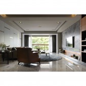
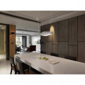
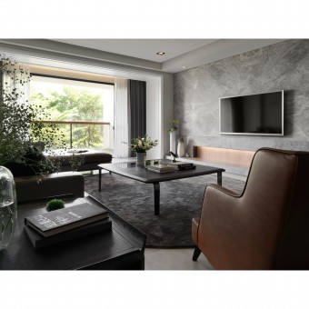
| DESIGN NAME: Living in Green and Lush PRIMARY FUNCTION: Interior Design INSPIRATION: The concise composition of lines is the main style of this project, which can bring out the refreshing feelings. The spatial strategy of hanging the slab on ceiling can enlarge the visual effects of vertical dimension. The hung slab with the light contrasting effects can match the specific white window frame, which can establish the visual connecting feelings between vertical and horizontal dimensions in the space. UNIQUE PROPERTIES / PROJECT DESCRIPTION: This is an interior design for an apartment flat near a green park. The owner has the characteristics of optimistic and lively, and required that the designer could establish a space to meet her needs of living in refreshing and tranquil life. For the owner's requirement, the designer's concept for this project is how to stretch out the sense of the interior space to make a connection with the outdoor green images in order to establish the space with natural feelings. OPERATION / FLOW / INTERACTION: This is a dedicated space to display the female owner's beauty and grace. PROJECT DURATION AND LOCATION: The project finished in 2016 in Taiwan. FITS BEST INTO CATEGORY: Interior Space and Exhibition Design |
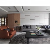
PRODUCTION / REALIZATION TECHNOLOGY: The white window frame can reflect and induce sunlight into the interior space, and light up the interior space with bright and warm atmosphere. The outdoor green image can also be framed by the white window frame as a lively natural painting. The green scenery can accompany the owner's life as the framed image changing through time. In order to correspond with the owner's personalities, the shiny metal material is embedded on the white wall which is connected with the white window frame. The composition of different materials can generate a sort of spatial feeling of light rhythm. SPECIFICATIONS / TECHNICAL PROPERTIES: This space is square meters. TAGS: Interior Design, Residence RESEARCH ABSTRACT: The folded slabs with wooden material can stretch the spatial feelings of the living room with wide visual effect. This kind of spatial strategy with different material can create a kind of transition area between public and private spaces. Furthermore, the iron-gray sofa set and the red-brown single chair can match with the white wall and the wooden slabs, which is the demonstration of considerate colors scheme for spatial balance. This is the most elaborate part of this project which can demonstrate the designer's deep professional ability and experiences. CHALLENGE: The designer arranges the entry door of reading room at the central part of the wall for displaying the symmetric aesthetics, which is the spatial strategy to deal with the problem that the path towards the private area is a bit narrow. On the two sides of the entry door, there are two concave spaces for the floral decoration. This arrangement can balance the spatial proportion and increase the flexibility for owner to change the flora decoration occasionally. ADDED DATE: 2017-08-07 06:27:38 TEAM MEMBERS (1) : Jui-Hsiang Pai IMAGE CREDITS: Zhi-Wu Interior Design |
||||
| Visit the following page to learn more: http://www.zhiwu.com.tw/ | |||||
| AWARD DETAILS | |
 |
Living in Green and Lush Interior Design by Jui-Hsiang Pai is Winner in Interior Space and Exhibition Design Category, 2017 - 2018.· Read the interview with designer Jui-Hsiang Pai for design Living in Green and Lush here.· Press Members: Login or Register to request an exclusive interview with Jui-Hsiang Pai. · Click here to register inorder to view the profile and other works by Jui-Hsiang Pai. |
| SOCIAL |
| + Add to Likes / Favorites | Send to My Email | Comment | Testimonials | View Press-Release | Press Kit |
Did you like Jui-Hsiang Pai's Interior Design?
You will most likely enjoy other award winning interior design as well.
Click here to view more Award Winning Interior Design.


