House in Silverstrand Residential Space by Michael Liu |
Home > Winners > #58803 |
 |
|
||||
| DESIGN DETAILS | |||||
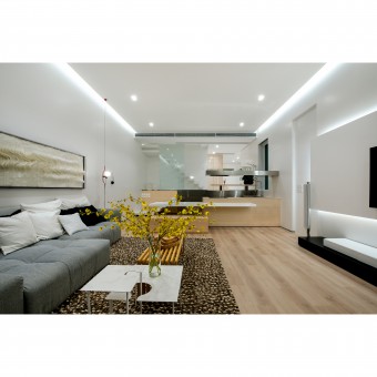
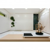
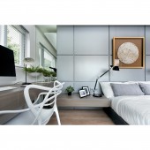
| DESIGN NAME: House in Silverstrand PRIMARY FUNCTION: Residential Space INSPIRATION: The owners have been living there for over 15 years and knowing the shortcomings of the place, they were keen to transform the place into an innovative, yet, practical house to better suit their needs. So, the designer carefully analyzed the original flow of the house and the owners' habits and tailor made a new flow for the owners. UNIQUE PROPERTIES / PROJECT DESCRIPTION: In order to improve the owner's living quality effectively, the designer carefully analyzed the original flow of the house and the owners' habits and tailor made a new flow for the owners, such as changing the location of the entrance, the area of the upper part and the staircases. After implementing the structural adjustment, the designer applied simple yet sophisticated interiors design throughout the house by choosing light and pale materials as the main tone. OPERATION / FLOW / INTERACTION: Moreover, since the owners seldom cook, designing a simple cooking space is sufficient. So the designer boldly demolished the original kitchen, re-positioned the entrance and added a foyer, so that visitors can gradually experience different spaces while entering the house. Meanwhile, a large space in the upper part on the ground floor was freed up, the designer merged that excess space with the lower part for an open kitchen. Even more interesting is that the designer found that by relocating the staircase, the redundant corridors in the second level can be removed, so that the utility rate of each room can be increased by around 20-45%. As the result, not only did it even out the sizes of the children's rooms, but also doubled the size of the walk-in closet in the master bedroom. PROJECT DURATION AND LOCATION: It is located in the Silverstrand in Hong Kong. FITS BEST INTO CATEGORY: Interior Space and Exhibition Design |
PRODUCTION / REALIZATION TECHNOLOGY: After implementing the structural adjustment, the designer applied simple yet sophisticated interiors design throughout the house by choosing light and pale materials as the main tone, creating a relaxed and serene feeling. Also, the structure line of the floating staircase, open kitchen countertops and benches work cohesively to create a sense of architectural aesthetics. SPECIFICATIONS / TECHNICAL PROPERTIES: It is a 3000 square feet house. TAGS: Residential, House, Simple, Sophisticated, Relaxed RESEARCH ABSTRACT: After meetings and interviews with the owners, the designer know more about the habit of them. So, the design is practical and tailor made for them. CHALLENGE: Built among the mountains, the original living room and dining room were separated by sublevels. The dining area in the upper part was the first area to see after entering the house, disturbing the practical flow. In addition, the original foyer lacked storage space, leaving the owners no choice but to place the shoe closet below the stairs. The uneven size of their children’s rooms and inadequate walk-in closet space in the master bedroom were defects that deteriorated the living quality of the owner. ADDED DATE: 2017-07-04 08:09:15 TEAM MEMBERS (1) : IMAGE CREDITS: All photo credits to Millimeter Interior Design Limited |
||||
| Visit the following page to learn more: http://www.millimeter.com.hk | |||||
| AWARD DETAILS | |
 |
House in Silverstrand Residential Space by Michael Liu is Winner in Interior Space and Exhibition Design Category, 2017 - 2018.· Read the interview with designer Michael Liu for design House in Silverstrand here.· Press Members: Login or Register to request an exclusive interview with Michael Liu. · Click here to register inorder to view the profile and other works by Michael Liu. |
| SOCIAL |
| + Add to Likes / Favorites | Send to My Email | Comment | Testimonials | View Press-Release | Press Kit |
Did you like Michael Liu's Interior Design?
You will most likely enjoy other award winning interior design as well.
Click here to view more Award Winning Interior Design.


