|
|
|

|
|
| DESIGN DETAILS |
DESIGN NAME:
Essentialia Skincare
PRIMARY FUNCTION:
Packaging Design
INSPIRATION:
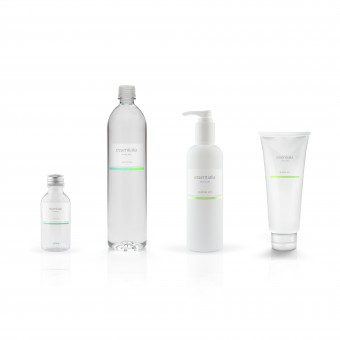
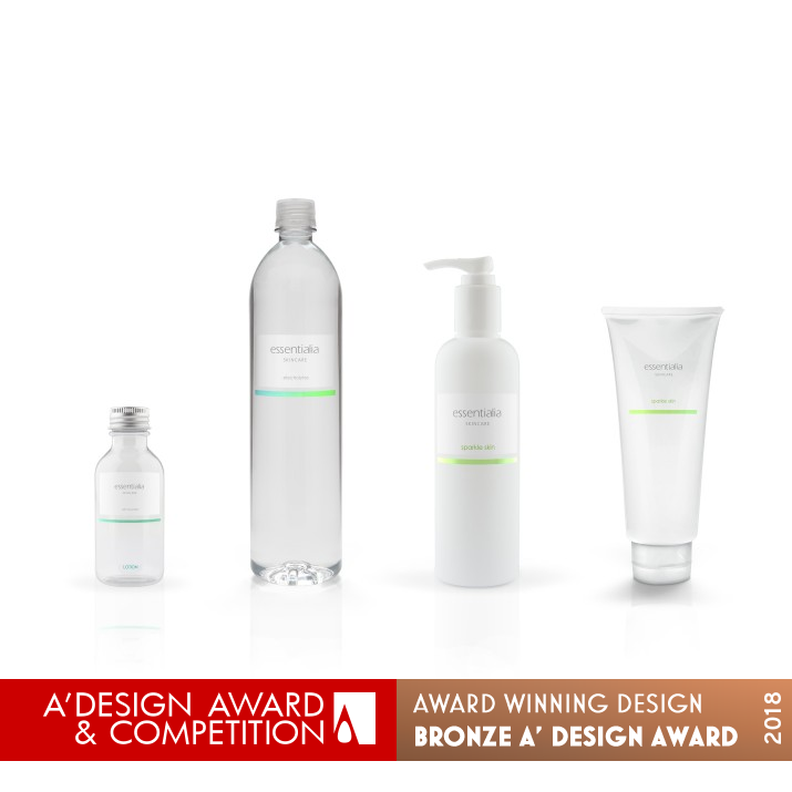
Essentialia's products use only the best ingredients. We designed the packaging for several of their products. We decided to create a clean design that can showcase their message.
UNIQUE PROPERTIES / PROJECT DESCRIPTION:
Essentialia is a new company that specializes in skincare and beauty products. Bringing the most natural and organic products to its customers. The brand was developed to reflect its name Essentialia meaning the most essential or most vital part of some idea or experience.
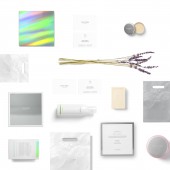
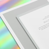
Packaging was created using silver chrome to work seamlessly with the colorful, sophisticated language of the identity. Keeping the identity and packaging minimal.
OPERATION / FLOW / INTERACTION:
Our goal from the start was to reflect its name Essentialia meaning the most essential or most vital part of some idea or experience.
The little touches of silver chrome and color foil used within the packaging and typography echoes the high-end quality of the product.
PROJECT DURATION AND LOCATION:
This project started in May 2015 and it was completed in November 2015 in Miami, FL USA.
FITS BEST INTO CATEGORY:
Packaging Design
|
PRODUCTION / REALIZATION TECHNOLOGY:
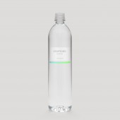
We combined the use of silver foil and colors to add an essential touch to the white bottles in the packaging.
SPECIFICATIONS / TECHNICAL PROPERTIES:
N/A
TAGS:
skincare, minimal, modern, packaging design, identity, packaging
RESEARCH ABSTRACT:
-
CHALLENGE:
Cost & budget. Maintaining identity from packaging to print design.
ADDED DATE:
2017-07-01 15:26:24
TEAM MEMBERS (1) :
Paola Diaz Janna, Maas Studio
IMAGE CREDITS:
Maas Studio
|
|
| CLIENT/STUDIO/BRAND DETAILS |
 |
NAME:
Maas Studio
PROFILE:
Maas is a Miami based design and branding studio. We have the flexibility of working closely with our clients in every step of the design process. We work to produce the highest quality design while sticking to our core principle of simplicity.
Our clients range from start-ups to established companies from Asia to South America. We partner with our clients to understand their goals and objectives. Great relationships lead to great design.
|
|
|
| COMMENTS |
| Giulia Esposito |
Comment #5670 on December 25, 2022, 7:02 pm |
|
I'm absolutely in awe of the Essentialia Skincare packaging design by Maas Studio. It is a brilliant example of the creativity and functionality that can be combined in a modern packaging design. The colors, graphics, textures, and typography all work together to create a stunning visual presentation. The packaging design truly captures the essence of the product, and is sure to draw customers to it. It's no surprise that this work was selected for such a prestigious design award! Congratulations to Maas Studio for their incredible achievement!
|
| Chloe Turner |
Comment #52717 on January 3, 2023, 6:35 pm |
|
I am so impressed with this packaging design! It is an absolute work of art that perfectly conveys the message of Essentialia's products. It is incredibly clean and sophisticated and really captures the brand's high-end quality. It is obvious that a lot of thought was put into the design and it really makes the products stand out. Well done on winning this award, it is certainly well deserved!
|
|
|
Did you like Maas Studio's Packaging Design?
You will most likely enjoy other award winning packaging design as well.
Click here to view more Award Winning Packaging Design.
Did you like Essentialia Skincare Packaging Design? Help us create a global awareness for good packaging design worldwide. Show your support for Maas Studio, the creator of great packaging design by gifting them a nomination ticket so that we could promote more of their great packaging design works.
|
|

|
|
|
|
