Topposition Construction Office by Keng-Fu Lo |
Home > Winners > #58341 |
 |
|
||||
| DESIGN DETAILS | |||||
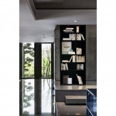
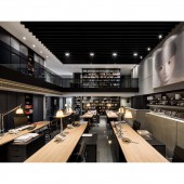
| DESIGN NAME: Topposition Construction PRIMARY FUNCTION: Office INSPIRATION: Originally the plane is not related to the curved wall at the entrance outside the architecture; however, based on the idea of creating more coordination between space and architecture. The original arrangement was all atrium spaces, so how to use this space is that I need to think about. Geometry and vertical style design create an extreme vision and atmosphere. Hopefully it is not only a working space, but also a space with resonance from people. UNIQUE PROPERTIES / PROJECT DESCRIPTION: The space is an office near outside of the headquarters. The first sight after entering the space is floor slab of the second floor, the colors of the floor and book wall separate working area and multi- functional area. The French windows are set at the end of movement path to lead the sunshine and green inside. The book wall is used to make the sense of penetration between floors, and the boundaries between floors are removed. OPERATION / FLOW / INTERACTION: The side entrance breaks the original pattern and makes the buffer for the original route in the space. The colors of the floor and book wall separate working area and multi- functional area, and the French windows are set at the end of movement path to lead the sunshine and green inside. Stairs go up with bookcase, so that the users can have the visual and memory connection with books and the interference to the working area can be decreased. PROJECT DURATION AND LOCATION: The project started in November 2015 in Kaohsiung and finished in November 2016 in Kaohsiung, and was exhibited in December 2016. FITS BEST INTO CATEGORY: Interior Space and Exhibition Design |
PRODUCTION / REALIZATION TECHNOLOGY: The curved wall at the entrance is created to connect office and headquarters, by using stone materials extend to interior space from outdoors. The sample display area is set behind to provide users a place to collect and discuss, the concretes used on short wall and the wall surface. The bookcase is used to make the sense of penetration between floors. By combining the upper and lower bookcase, the connection between two floors is increased, and the boundaries between floors are removed. SPECIFICATIONS / TECHNICAL PROPERTIES: The space is 707.4 sq. m. TAGS: Taiwan, Kaohsiung, interior space, storage, Office RESEARCH ABSTRACT: Because of book wall, the interference and west sun exposure at working area are decreased, and more stable working environment is provided. The small angle and high lumen light source is used at working area with empty space to decrease the weakness of long light projection. The table light is set at the table to provide single spot projection, and different halo is used to create different arrangement in a space. CHALLENGE: The original arrangement was all atrium spaces, however, the perfect arrangement is designed to enhance the use of space and achieve the feeling of cohesion to remove the sense of pressure. The concretes used on short wall and the wall surface. It is hoped to use the least material to make the biggest effect of extension. ADDED DATE: 2017-06-16 09:25:12 TEAM MEMBERS (1) : Chief Designer: KENG-FU LO IMAGE CREDITS: Keng-Fu Lo, 2017. |
||||
| Visit the following page to learn more: http://www.chain10.com | |||||
| AWARD DETAILS | |
 |
Topposition Construction Office by Keng-Fu Lo is Winner in Interior Space and Exhibition Design Category, 2017 - 2018.· Read the interview with designer Keng-Fu Lo for design Topposition Construction here.· Press Members: Login or Register to request an exclusive interview with Keng-Fu Lo. · Click here to register inorder to view the profile and other works by Keng-Fu Lo. |
| SOCIAL |
| + Add to Likes / Favorites | Send to My Email | Comment | Testimonials | View Press-Release | Press Kit | Translations |
Did you like Keng-Fu Lo's Interior Design?
You will most likely enjoy other award winning interior design as well.
Click here to view more Award Winning Interior Design.


