Saxo Packaging design for gin by Gabriela Chelsoi - CreativeByDefinition |
Home > Winners > #58148 |
 |
|
||||
| DESIGN DETAILS | |||||
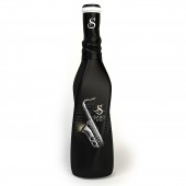
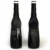
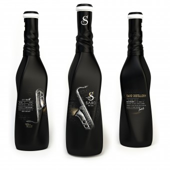
| DESIGN NAME: Saxo PRIMARY FUNCTION: Packaging design for gin INSPIRATION: The inspiration for this concept was the sound of jazz music, its history and birth place, the city of New Orleans. The project is visually describing the waves of the music, the feeling it creates when it is heard. The design is celebrating the city of New Orleans, takes its foundation from the only place in the New World where slaves were allowed to own drums. The packaging design represents an immersion in this particular style of music, simply translating sounds into images, shapes & contrasts. UNIQUE PROPERTIES / PROJECT DESCRIPTION: A mix of dark contrasts, curve lines and fade in images are creating this packaging design and the jazz atmosphere. The unique shape of the bottle, twisted and curved on the central axis, communicates a dark, musically intense vibe. The labeling recreates in the background a vintage image of a newspaper, where the eye can find key words describing Jazz music. The black color is erasing parts of the label, while accentuating others. OPERATION / FLOW / INTERACTION: Listening to these famous Jazz artists, understanding the mood they experience when they create,reading about their music helped in developing the complete perspective and also all the small details of this concept. The classical illustration of the saxophone, the newspaper style text that is fading into the dark background, the construction of the logo, all the elements are letting music be the guide. PROJECT DURATION AND LOCATION: The project started in Bucharest, Romania and it lasted 4 months to complete. FITS BEST INTO CATEGORY: Packaging Design |
PRODUCTION / REALIZATION TECHNOLOGY: The packaging uses like main material black opaque glass. The glass bottle is twisted around the central axis and uses like starting base shape a rectangle and also a circle. SPECIFICATIONS / TECHNICAL PROPERTIES: Width 70mm x Depth 70mm X Height 300mm TAGS: gin packaging, spirts packaging design, design, beverage packaging design, art direction, branding, visual identity, packaging RESEARCH ABSTRACT: The design research started by following the history of jazz that began in the late 19th century; the place of its birth, the city New Orleans, where artists like Nick LaRocca, Papa Jack Laine's band and many others represented the core of this type of music and movement. All these city history,the musicians, lay the foundation of the research for this project. The energy vibes and musical tones of the city of New Orleans were born even before Jazz music, because the city always considered music to be a necessity. CHALLENGE: The main challenge for this project was translating into the packaging, labeling and identity of the product the actual mood that the rhythm of Jazz creates when is played, the dark, curvy tones of the music that is taking control of the listener body and soul. This challenge was over came by combining a dark pallete with highlights with more different twisted shapes that gave the visual illusion that they are moving in the same direction with the sound, until the best combination was discovered. ADDED DATE: 2017-05-31 08:28:56 TEAM MEMBERS (1) : Gabriela Chelsoi IMAGE CREDITS: Image #1 Gabriela Chelsoi / Packaging Designer & Architect Image #2 Gabriela Chelsoi / Packaging Designer & Architect Image #3 Gabriela Chelsoi / Packaging Designer & Architect Image #4 Gabriela Chelsoi / Packaging Designer & Architect Image #5 Gabriela Chelsoi / Packaging Designer & Architect PATENTS/COPYRIGHTS: Copyrights belongs to CreativeByDefinition, Gabriela Chelsoi |
||||
| Visit the following page to learn more: http://bit.ly/2sls5ow | |||||
| AWARD DETAILS | |
 |
Saxo Packaging Design For Gin by Gabriela Chelsoi-Creativebydefinition is Winner in Packaging Design Category, 2017 - 2018.· Read the interview with designer Gabriela Chelsoi - CreativeByDefinition for design Saxo here.· Press Members: Login or Register to request an exclusive interview with Gabriela Chelsoi - CreativeByDefinition. · Click here to register inorder to view the profile and other works by Gabriela Chelsoi - CreativeByDefinition. |
| SOCIAL |
| + Add to Likes / Favorites | Send to My Email | Comment | Testimonials | View Press-Release | Press Kit |
Did you like Gabriela Chelsoi-Creativebydefinition's Packaging Design?
You will most likely enjoy other award winning packaging design as well.
Click here to view more Award Winning Packaging Design.


