Bestchem Corporate Identity by Tsung-Hua Yang |
Home > Winners > #58109 |
 |
|
||||
| DESIGN DETAILS | |||||
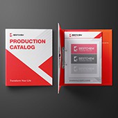
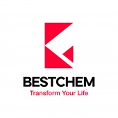
| DESIGN NAME: Bestchem PRIMARY FUNCTION: Corporate Identity INSPIRATION: The inspiration for this project stemmed from bestchem’s own corporate vision. During the discussion stage of design development, the designers reached the conclusion that while chemicals and the companies that produce them are often viewed negatively, bestchem sees its mission as one of using chemistry to better people’s lives. They then developed the Metamorphosis design concept to symbolize bestchem’s growth and development and the public’s changing perceptions, with the goal of rebranding the company to create a positive corporate image and express an upbeat, forward-looking attitude. UNIQUE PROPERTIES / PROJECT DESCRIPTION: The solid red triangle on the logo symbolizes the integration of company, employee, and customer into a single entity. The negative space creates a second, white triangle partially overlapped by the red one, which it evolves form. This represents the planned transition and the connection between the company and the greater public. The precise lines of the logo directly convey the company’s exacting standards and commitment, while the color red set off against the pure white draws the viewer in. OPERATION / FLOW / INTERACTION: The logo is the first thing a potential customer notices, and its design can be expanded on to help completely reinvent a company’s image. The designers developed a logo design for bestchem intended to convey the company’s belief in its mission to its target audience, to close the gap between company and customer, and to create an image of trust and reputability. PROJECT DURATION AND LOCATION: The project started in January 2017 in Taoyuan and finished in June 2017 in Taoyuan. FITS BEST INTO CATEGORY: Graphics, Illustration and Visual Communication Design |
PRODUCTION / REALIZATION TECHNOLOGY: The design process was heavily based on initial strategic discussions, in which the designers explored and determined the requirements for the logo design. By repeatedly reviewing concepts and compositions, they were able to create a logo that fully illustrated the qualities of the company. SPECIFICATIONS / TECHNICAL PROPERTIES: The entire project contained numerous applied design elements and spanned both digital media and physical promotional materials. The design team used the Pantone Color Guide for color management and calibration to ensure color consistency of the design across different media formats. TAGS: Corporate Identity, VIS, Rebranding RESEARCH ABSTRACT: Prior to designing the logo, the designers extensively researched the background, culture, history, and prospects of the company, its standing in the market, and what distinguished it from its competitors. These efforts helped them clarify their goals for establishing a new company image. CHALLENGE: Bestchem hopes that its rebranding efforts will be the starting point for the company’s planned transition. The primary challenge of the project was putting a positive spotlight on the company’s expansion and diversification while simultaneously maintaining a focus on its original company values. ADDED DATE: 2017-05-28 07:06:11 TEAM MEMBERS (1) : IMAGE CREDITS: BYEn, 2017 |
||||
| Visit the following page to learn more: http://www.byen.biz | |||||
| AWARD DETAILS | |
 |
Bestchem Corporate Identity by Tsung-Hua Yang is Winner in Advertising, Marketing and Communication Design Category, 2017 - 2018.· Read the interview with designer Tsung-Hua Yang for design Bestchem here.· Press Members: Login or Register to request an exclusive interview with Tsung-Hua Yang. · Click here to register inorder to view the profile and other works by Tsung-Hua Yang. |
| SOCIAL |
| + Add to Likes / Favorites | Send to My Email | Comment | Testimonials | View Press-Release | Press Kit |
Did you like Tsung-Hua Yang's Advertising Design?
You will most likely enjoy other award winning advertising design as well.
Click here to view more Award Winning Advertising Design.


