Euphrat Food packaging by Musa Celik |
Home > Winners > #58075 |
 |
|
||||
| DESIGN DETAILS | |||||
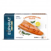
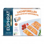
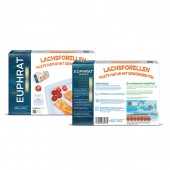
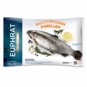
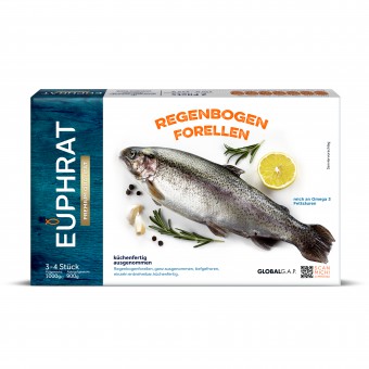
| DESIGN NAME: Euphrat PRIMARY FUNCTION: Food packaging INSPIRATION: The main inspiration of this packaging is the product itself. Logo was redesigned to give packed fish message and blue-white atmosphere of marinas was used in the background. UNIQUE PROPERTIES / PROJECT DESCRIPTION: Euphrat is a packed fish brand which is produced in Gaziantep and exported to Germany. Modern packaging designs were demanded for Euphrat to sell the product in main hypermarket chains of Germany. Packaging designs based on naturalness and appetite appeal were prepared for Euphrat. Fish visuals were decorated with garnitures and spices and they located at the center of the design. Logo was redesigned with a modern font and a fish figure was used above the U to give packed fish message. OPERATION / FLOW / INTERACTION: The fact that the salmon fish on the packaging is much closer to the real colour and looks delicious has created a positive perception in the consumer. QR cods placed on the side and back of the packaging also helped to create high confidence in consumers access to all production details of the product in the package. PROJECT DURATION AND LOCATION: The project was started on January 2016 and finished on March 2016 in Istanbul/Turkey. FITS BEST INTO CATEGORY: Packaging Design |
PRODUCTION / REALIZATION TECHNOLOGY: Same graphic design was used for box and flexi packages. Box material: paper Flexi material: plastic SPECIFICATIONS / TECHNICAL PROPERTIES: 250gr Pack: H: 223 mm W: 130 mm D: 39 mm 500gr Pack: H: 265 mm W: 195 mm D: 45 mm 1000gr Pack: H: 265 mm W: 195 mm D: 45 mm TAGS: box, packaging, design, modern, fish, food, redesign, stylish RESEARCH ABSTRACT: Online research was conducted for the project. Several samples related food packaging and different box designs were collected and examined. Latest trends in box design and marketing, good and bad design examples, shortcomings of the category were all noted. Thus, the design process was started with a detailed knowledge of the competitors and category. CHALLENGE: The main challenge of the project was to design a European style plain package with high quality perception. A metalized frame was used under the logo with the aim of increasing “premium quality” perception. To avoid unnecessary complexity, a plain lay out was preferred. ADDED DATE: 2017-05-24 03:05:08 TEAM MEMBERS (2) : Musa Çelik and Reşan İlhan IMAGE CREDITS: Musa Celik, 2017. |
||||
| Visit the following page to learn more: http://www.tasarist.net/ | |||||
| AWARD DETAILS | |
 |
Euphrat Food Packaging by Musa Celik is Winner in Packaging Design Category, 2017 - 2018.· Read the interview with designer Musa Celik for design Euphrat here.· Press Members: Login or Register to request an exclusive interview with Musa Celik. · Click here to register inorder to view the profile and other works by Musa Celik. |
| SOCIAL |
| + Add to Likes / Favorites | Send to My Email | Comment | Testimonials | View Press-Release | Press Kit |
Did you like Musa Celik's Packaging Design?
You will most likely enjoy other award winning packaging design as well.
Click here to view more Award Winning Packaging Design.


