Amaro 33 Grappa- based liqueur by YG Design |
Home > Winners > #57863 |
 |
|
||||
| DESIGN DETAILS | |||||
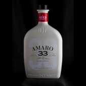
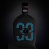
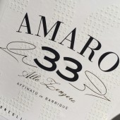
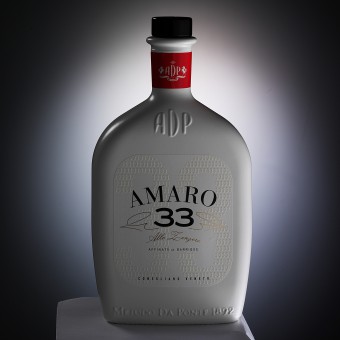
| DESIGN NAME: Amaro 33 PRIMARY FUNCTION: Grappa- based liqueur INSPIRATION: The creative inspiration behind the packaging was related to mixing the classical codes of this type of drink with a very contemporary touch to attract a young public objective. Being a new product of the distillery, it was key to outstand at the selling points, being noticed and communicating the public the fact that it is not a traditional distillate. An attractive packaging according to the objective public was the basis of this project. UNIQUE PROPERTIES / PROJECT DESCRIPTION: Amaro is a grappa- based liqueur. This product is the spearhead of a change towards a major updating of the manufacturer which allows an improvement in the distillery profile regarding other traditional-style products. The objective was to enter with this product in the world of high-quality amaros, as well as to achieve a position from an innovative stand, expecting to be seen as contemporary, functional, avant-garde and simple at the same time. OPERATION / FLOW / INTERACTION: During daytime the label looks elegant and contemporary, while at night it brightens up and the brand shines in the dark. PROJECT DURATION AND LOCATION: The project started in November 2015 and finished in 2016, and was exhibited in December 2016 FITS BEST INTO CATEGORY: Packaging Design |
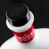
PRODUCTION / REALIZATION TECHNOLOGY: Packaging Substrate:Plastic Printing Process : Flexography, Screen printing, Foil stamping, Glow in the dark SPECIFICATIONS / TECHNICAL PROPERTIES: As a result, we used a typical hip flask as a base, which was modelled in shape and details with texture on the front and back, and a label that in daytime looks elegant and contemporary and at night, glows showing the brand name in the dark. TAGS: Spirit, Grappa, Packaging, Design, Italy RESEARCH ABSTRACT: We conducted desk research to analyze and understand the competitive set and to learn more about other distilleries and industry trends. Our limited budget did not allow us to use focus groups or conduct other primary market research. We had to adapt to the existing circumstances. Research objectives: to come up with a creative and attractive packaging design. Participants: Project Manager Office, Art Director, Designers, and Client. The creative routes explored converged in a successful result CHALLENGE: The first challenge was going into the world of distilled beverages. This was a whole new world for us to explore and we were very excited. It was a big challenge and we knew there was no room for error. We had to use innovative techniques to show that this was no ordinary Amaro. Amaro 33 has a very distinctive flavor that stems from different and singular ingredients. The second challenge was to design an attractive and unusual label. We wanted consumers to realize that the design hid something, something that could not be readily perceived. We used glow-in-the-dark ink to account for all those special hidden flavors. Lastly, we embarked on a detailed technical work to overcome the third big challenge: designing the bottle. We came up with a unique bottle, which was completely different from the ones previously used at the distillery in terms of shape, color, and style. We took up this huge challenge as a team, working closely with our client. The result was very successful. ADDED DATE: 2017-04-27 16:33:48 TEAM MEMBERS (1) : YG team IMAGE CREDITS: - |
||||
| Visit the following page to learn more: http://yg-d.com/ | |||||
| AWARD DETAILS | |
 |
Amaro 33 Grappa-Based Liqueur by Yg Design is Winner in Packaging Design Category, 2017 - 2018.· Read the interview with designer YG Design for design Amaro 33 here.· Press Members: Login or Register to request an exclusive interview with YG Design. · Click here to register inorder to view the profile and other works by YG Design. |
| SOCIAL |
| + Add to Likes / Favorites | Send to My Email | Comment | Testimonials | View Press-Release | Press Kit |
Did you like Yg Design's Packaging Design?
You will most likely enjoy other award winning packaging design as well.
Click here to view more Award Winning Packaging Design.


