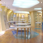
Loja do AquaRio Giftshop by Kube Arquitetura |
Home > Winners > #57709 |
 |
|
||||
| DESIGN DETAILS | |||||
| DESIGN NAME: Loja do AquaRio PRIMARY FUNCTION: Giftshop INSPIRATION: For this project, Kube was inspired by the only information they had: a humpback whale's skeleton is hang in Aquarium’s entrance hall and its best view is from inside the store. Instead of fitting rooms, shells. Instead of paint in the walls, sand. Instead of a plain floor, pebbles. By creating a rich atmosphere in sensory spurs surrounding the visitor, the store becomes a place that can be felt without being noticed. A one and only engaging experience while visiting AquaRio. UNIQUE PROPERTIES / PROJECT DESCRIPTION: AquaRio's gift shop has 420sqm and was designed by Kube Arquitetura. It's a walkthrough store. Its main displays were inspired by the organic curves of whale's ribs, giving the space a flowing and light movement, and also allowing a flexibility in the mix of products. The "rib" displays allow the products to be revealed little by little, creating levels of intimacy while they walk around. The blue in the beginning of the store makes the visitors want to dive in that space. OPERATION / FLOW / INTERACTION: - PROJECT DURATION AND LOCATION: Aquário Marinho do Rio de Janeiro FITS BEST INTO CATEGORY: Interior Space and Exhibition Design |
PRODUCTION / REALIZATION TECHNOLOGY: - SPECIFICATIONS / TECHNICAL PROPERTIES: 420sqm TAGS: aquarium, retail, store, design, retail design RESEARCH ABSTRACT: - CHALLENGE: - ADDED DATE: 2017-04-11 13:45:11 TEAM MEMBERS (5) : Juliana Neves, Taia Mendes, Raphaela Fogaça, Carolina Magoga and Lucia Santoro IMAGE CREDITS: Talitha Soares |
||||
| Visit the following page to learn more: http://www.aquariomarinhodorio.com.br/ | |||||
| AWARD DETAILS | |
 |
Loja Do Aquario Giftshop by Kube Arquitetura is Winner in Interior Space and Exhibition Design Category, 2016 - 2017.· Read the interview with designer Kube Arquitetura for design Loja do AquaRio here.· Press Members: Login or Register to request an exclusive interview with Kube Arquitetura. · Click here to register inorder to view the profile and other works by Kube Arquitetura. |
| SOCIAL |
| + Add to Likes / Favorites | Send to My Email | Comment | Testimonials | View Press-Release | Press Kit |
Did you like Kube Arquitetura's Interior Design?
You will most likely enjoy other award winning interior design as well.
Click here to view more Award Winning Interior Design.


