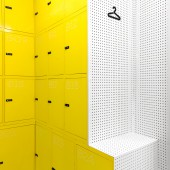
Lock and Be Free Urban locker by Wanna One |
Home > Winners > #57494 |
 |
|
||||
| DESIGN DETAILS | |||||
| DESIGN NAME: Lock and Be Free PRIMARY FUNCTION: Urban locker INSPIRATION: The challenge of our studio was to shape the brand concept, Leave your luggage, live the city, and rejuvenate the image of the old and cliche lockers (with its poorly lit and narrow aisles full of gray lockers). UNIQUE PROPERTIES / PROJECT DESCRIPTION: The atmosphere in the store radiates surprisingly good vibes: a modern urban interior, yellow and white colors, exhaling freshness. The universe of the brand and its interior design scheme combines highly topical colors and materials: white peg boards, yellow lockers flanked by a circular font, a typical airport rubber floor and a powerful set of lights transmitting a lot of positive energy. The matte and glossy materials achieve the desired bulky look to an extremely small space, only 30 m2. OPERATION / FLOW / INTERACTION: Everything in that place is reigned by dialogue and a pleasant atmosphere. For travelers who go through life lost in translation, Wanna One studio has provided a simple icon-based signposting so travelers can guide themselves on their own and can feel at ease at all times. At a glance you can check the weather of the day in the Spanish capital, the average time to get back to the airport and the prices for the provided services. PROJECT DURATION AND LOCATION: The project started in January 2016 in Madrid (Spain) and finished at the end of March 2016. FITS BEST INTO CATEGORY: Interior Space and Exhibition Design |
PRODUCTION / REALIZATION TECHNOLOGY: Metal with rubber are the two main materials in the store. All the materials combine two terminations; mate (floor) and shine (walls and lockers) this trick is able to provide a volume sensation to the shop, even than the real area has only 30 m2, thanks to this, it looks much bigger and you avoid the narrow sensation. SPECIFICATIONS / TECHNICAL PROPERTIES: The store is an extremely small space, only 30 m2, but in which one feels at ease. TAGS: urban lockers, vibrant travelers lockers, Madrid, luggage lockers, leave your luggage live the city RESEARCH ABSTRACT: Wanna One developed an image and marketing consultancy 360 degrees, that embraced the definition of a brand strategy based in a precise analysis of the national and international competitive environment and the global trends to the creation of the brand, its universal concept and the later interiorism and graphics created for the store. The studio detected that there are many travelers alone with their luggage in the center of Madrid. Imagine the situation: very early in the morning or very late at night. Crowded airports. An idyllic journey overcast with having to drag a heavy suitcase while grasping the last minutes in town. With Lock and Be Free, travelers can rent lockers with flexible hours, solving these impasses in which one is left hand in hand with his suitcase, with no place to leave it. CHALLENGE: For the main entrance façade, it was not possible to make many esthetic changes due to the fact that it is protected by Madrid’s Council and modifications were not allowed. Only a flag and a sign with the “Lock & Be Free” brand was allowed by the authorities. The really main difficulty in the project was the space. As it was really small and the client needed a number of lockers to create a rentable business. We have had to deal with it to set up the optimal lockers number. ADDED DATE: 2017-04-05 12:29:07 TEAM MEMBERS (2) : Strategy: Cathy Figueiredo and Creative Director: Esther Mengual IMAGE CREDITS: Photographer: Caulin Photo |
||||
| Visit the following page to learn more: http://wannaone.es/ | |||||
| AWARD DETAILS | |
 |
Lock and Be Free Urban Locker by Wanna One is Winner in Interior Space and Exhibition Design Category, 2016 - 2017.· Read the interview with designer Wanna One for design Lock and Be Free here.· Press Members: Login or Register to request an exclusive interview with Wanna One. · Click here to register inorder to view the profile and other works by Wanna One. |
| SOCIAL |
| + Add to Likes / Favorites | Send to My Email | Comment | Testimonials | View Press-Release | Press Kit |
Did you like Wanna One's Interior Design?
You will most likely enjoy other award winning interior design as well.
Click here to view more Award Winning Interior Design.


