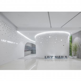
Lily Nails Salon Salon by Wenqiang Han |
Home > Winners > #57467 |
| CLIENT/STUDIO/BRAND DETAILS | |
 |
NAME: Arch Studio PROFILE: Wenqiang Han, the founder and principle architect of Arch Studio, is also a teacher in CAFA (China Central Academy of Fine Arts). Combining with his teaching and researches, he focuses on the contemporary architectural and interior design based on traditional cultural background, devoted to making space to be the communication medium between people and people, people and environment, and creating a livable life. His major works includes Tea House in Hutong, Organic Farm, Rongbaozhai Coffee Bookstore, etc. He has been featured as 2015 One of the Best Ten International "Design Vanguard" by American renowned magazine "Architectural Record", and awarded as 2015 "AD100 China's Most Influential Architecture and Design Elites". His works have been widely published by home and abroad renowned publications. |
| AWARD DETAILS | |
 |
Lily Nails Salon Salon by Wenqiang Han is Winner in Interior Space and Exhibition Design Category, 2016 - 2017.· Press Members: Login or Register to request an exclusive interview with Wenqiang Han. · Click here to register inorder to view the profile and other works by Wenqiang Han. |
| SOCIAL |
| + Add to Likes / Favorites | Send to My Email | Comment | Testimonials | View Press-Release | Press Kit |


