Bloom Tea Packaging Tea Packaging and Branding by Danyang Pang |
Home > Winners > #57059 |
 |
|
||||
| DESIGN DETAILS | |||||
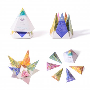
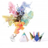
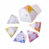
| DESIGN NAME: Bloom Tea Packaging PRIMARY FUNCTION: Tea Packaging and Branding INSPIRATION: Today people live in a fast paced society under a lot of pressure. Drinking tea is a valuable way to enjoy life. It is also a method to keep relaxed. I started with the sense of romance, explored some symbols, then found a “bloom” is a visual symbol to deliver a romantic experience and comfort people. So I imitated flower blooms for the structure of the packaging as well as the logo. UNIQUE PROPERTIES / PROJECT DESCRIPTION: The packaging's structure imitates a bloom. It can pop-up when a customer opens the packaging, just like the blooming process. The graphics are illustrated in watercolor which is inspired by water vapour, giving a sense of romantic. The outside look is white and simple which a contrasts to the colorful inside. The packaging can be closed smartly by interlocking one piece into another. A soothing sip will bring more inspiration, especially when you pour the tea from the colorful and romantic blooming package. OPERATION / FLOW / INTERACTION: These three types of Bloom tea packaging meets any audience demands for product combos. They can start with 5 Flavor Multi-Pack and try different flavors. The package can pop up like a bloom and it feel like to pick a petal when you tear off a small pack. If have a specific preferred flavor, customers can choose a One Flavor Loose Tea Pack. The two pieces of packaging can interlock into each other. Or if it is not convenient to have a filter for tea leaves, customers can just buy a Tea-Bag-Pack. This package was considered more for function and transportation. Two packages can lock into each other to save space. Each small tea bag pack can be held on the cup after throwing the bag into the water. It can keep the tea bag from floating away. PROJECT DURATION AND LOCATION: The project started in March 2015 in New York and finished in May 2015 in New York. FITS BEST INTO CATEGORY: Packaging Design |
PRODUCTION / REALIZATION TECHNOLOGY: I developed the structure by abundant paper experiment. Then I created the branding identity. I illustrated graphics by watercolor ink. Then edited in Adobe Illustration with multiple visual experiment. SPECIFICATIONS / TECHNICAL PROPERTIES: 5 Flavor Multi-Pack Loose Tea_ 95mm x95mm x 100mm Each Flavor Loose Tea, 10 Servings_ 95mm x95mm x 100mm 5 Flavor Multi-Pack Tea Bag_ 95mm x95mm x 70mm TAGS: tea, bloom, structure, emotional, creative RESEARCH ABSTRACT: After researching the current tea markets and packaging designs, I found out that tea is an inspiring beverage for many creative projects. Many packagings were hence focused on this idea and endeavored on designing the wrap's graphics. However, the tea packaging should also inspire users in a more romantic and relaxed way by its distinct form and shape—ideas that I incorporated into my design. CHALLENGE: I want to create a special but eco-friendly shape for the package. It should follow the concept “bloom” and also have a functional convenience. Bloom's romantic feeling should not just be presented as a stable shape but also should be imitated during the opening process. Through the design I gave customers a feeling of walking through the garden and let them enjoy their relaxing time to the fullest. I started with a flower shape design, but it wasted paper and was over decorated. After many experiments, I finally came up with this simple but smart package. It is just assembled by simple triangular modules but can be presented in such dynamic form. ADDED DATE: 2017-03-27 18:30:09 TEAM MEMBERS (1) : Designer/ Illustrator/ Creator/ Photographer Danyang Pang, 2016 IMAGE CREDITS: Photographer/ Illustrator/ Creator/ Designer Danyang Pang 2016. PATENTS/COPYRIGHTS: copyright belong to Danyang Pang, 2015 |
||||
| Visit the following page to learn more: https://www.behance.net/gallery/25929637 |
|||||
| CLIENT/STUDIO/BRAND DETAILS | |
 |
NAME: Danyang Pang PROFILE: https://www.behance.net/dandanp |
| AWARD DETAILS | |
 |
Bloom Tea Packaging Tea Packaging and Branding by Danyang Pang is Winner in Packaging Design Category, 2016 - 2017.· Read the interview with designer Danyang Pang for design Bloom Tea Packaging here.· Press Members: Login or Register to request an exclusive interview with Danyang Pang. · Click here to register inorder to view the profile and other works by Danyang Pang. |
| SOCIAL |
| + Add to Likes / Favorites | Send to My Email | Comment | Testimonials | View Press-Release | Press Kit |
Did you like Danyang Pang's Packaging Design?
You will most likely enjoy other award winning packaging design as well.
Click here to view more Award Winning Packaging Design.


