skinn Fragrance Packaging by Ning Li |
Home > Winners > #56907 |
 |
|
||||
| DESIGN DETAILS | |||||
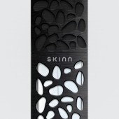
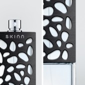
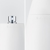
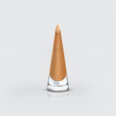
| DESIGN NAME: skinn PRIMARY FUNCTION: Fragrance Packaging INSPIRATION: Packaging is made to enrich the user’s experience and communicate the personality of products. Different senses play a vital role in ‘reading’ packages. Although we use sight as the primary sense in this, packaging is also held in the hands providing for opportunities for tactile communication. Form and materiality could be engaged more substantially to provide a more affective experience that communicates to the consumer. UNIQUE PROPERTIES / PROJECT DESCRIPTION: Skinn is an experimental packaging design using the visual-tactual language that is forms and materiality as tools for communicating an attribute of a product and as a means of conveying the intended target audience of a product. To examine the idea, I explore the 'tools' by focusing on beauty products, which is clear that the material's characteristics often used in defining a product and carry the most intimate links with its user. The enhanced texture of a product can increase the consumer-product relationship and provide a more affective experience that communicates to them. OPERATION / FLOW / INTERACTION: The name Skinn refers to the tactual language. Skin represents a transition between the outsides and insides. Skin to a human body is an organ that receives tactile sensory information and protects against injury. The skins of an object, in other words, is the term – packaging that we use today. They are not only the physical layer of protection but also the point of interface with users; their surfaces convey the identity of an object and contain the experience of an object. With this tactile interaction, the user can get an intuitive feeling of the products. PROJECT DURATION AND LOCATION: Started in September 2015 and finished in May 2016 in New York City, and was exhibited in the Pratt Show in May 2016. FITS BEST INTO CATEGORY: Packaging Design |
PRODUCTION / REALIZATION TECHNOLOGY: Material possesses meanings. By touching or looking at a product, we will generate a universal understanding of the material. The hard, rough, or rigid characteristic was usually perceived as the masculine type. The smoothness, softness, and lightness features are the symbol of the feminine. Some materials' meanings relate to an environment instead of the appearance. This type of materials would be considered as the category of gender-neutral. Therefore, the packaging's materials were applied based on this understanding. SPECIFICATIONS / TECHNICAL PROPERTIES: Packaging: 2in x 2in x 4.7in TAGS: Packaging, fragrance, skin, gender, masculine, feminine, neutral, perfume, tactile, material RESEARCH ABSTRACT: Based on my research, the following conclusions are appearing: objects that consumers buy are viewed as extensions of their own values and status; consumers desire a more affective shopping experience in today’s automatic selling environment; consumers’ emotional feelings are driven the shopping process; sense of touch provides people the most affective experience; the material-manipulatio CHALLENGE: Over these few years of working in the graphic design field, almost every artwork was asked to be created in an exaggerated and excessive way. As a designer, the more graphics I apply on the design, the better feedback I will receive from the client. However, as a consumer, I always think 'does the graphics of a packaging help me in decision making?' or 'I always want to find a product that can understand or represent me.' These questions bring me into the one-year exploration of visual-tactual communication and material experience. Although this topic has being discussed for a while, seldom do we see this design strategy being applied on the market. I created one solution by taking advantage of the material's universal meaning to communicate the product's information. My solution was based on my research result and the data I gathered from the survey. However, to apply the material accurately, we would need a much wider look into a social structure, nationality, and religion, etc. The reactions to my project have been very positive that reinforces my statement. I would love to explore the different categories of products, consumer types, and new generation. ADDED DATE: 2017-03-22 23:51:31 TEAM MEMBERS (2) : Designer: Ning Li and Instructor: Eric O'Toole, Thomas Delaney IMAGE CREDITS: All images: Ning Li |
||||
| Visit the following page to learn more: http://www.ninglidesign.com/skinn | |||||
| AWARD DETAILS | |
 |
Skinn Fragrance Packaging by Ning Li is Winner in Packaging Design Category, 2016 - 2017.· Read the interview with designer Ning Li for design skinn here.· Press Members: Login or Register to request an exclusive interview with Ning Li. · Click here to register inorder to view the profile and other works by Ning Li. |
| SOCIAL |
| + Add to Likes / Favorites | Send to My Email | Comment | Testimonials | View Press-Release | Press Kit |
Did you like Ning Li's Packaging Design?
You will most likely enjoy other award winning packaging design as well.
Click here to view more Award Winning Packaging Design.


