Kashi Kashi Cafe by Tomonobu Kawakami |
Home > Winners > #56776 |
 |
|
||||
| DESIGN DETAILS | |||||
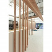
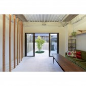
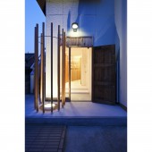
| DESIGN NAME: Kashi Kashi PRIMARY FUNCTION: Cafe INSPIRATION: The project is located in Akutagawa, Takatsuki city, Osaka which is a neighbouring city of Kyoto. This city is renowned for its history of tradition and local business. The owner decided to renovate a cafe on the existing ground floor, so communicate to all generations where her grew up all her life. UNIQUE PROPERTIES / PROJECT DESCRIPTION: Concept is Dance of wind. The deep floor space provided good natural ventilation. As the both ends of the space provide routes for wind, it allows dance of wind to happen within the space which is represented by those pillars. Unique location of timber pillars blur the boundary of inside and outside. OPERATION / FLOW / INTERACTION: The design aim is to provide a space for encounters not just of wind, but between people and place, and people and people. The project provides a garden area to enjoy tea and sweets. PROJECT DURATION AND LOCATION: The project started in November 2013 in Osaka and finished in October 2014. FITS BEST INTO CATEGORY: Interior Space and Exhibition Design |
PRODUCTION / REALIZATION TECHNOLOGY: The space was designed to create an atmosphere that provides senses of security and trust to customers so that it would put them. Placement of 45mm prisms with certain rhythm separates kitchen space, drink space. Circular partition creates security for customers at cafe who are more often than not vulnerable. The prisms are not painted for the purpose of leaving the rawness of the material open to be touched and felt, and ultimately contribute to the process of alteration, not aging, over time. SPECIFICATIONS / TECHNICAL PROPERTIES: Principal use:cafe Main Structure:existing building area:103,5 square meters Wall: AEP paint Ceiling: Deck plate with spray paint Flooring: Clear dust-proof paint on AEP paint Partition wall: 45 mm square wooden pillar (Constructional material of wall) TAGS: cafe, Sweets, Timber Pillar, Tea Room, Dance of Wind, Kyoto, Japan, Design, Space RESEARCH ABSTRACT: - CHALLENGE: I did not make a door to cut costs. We did not make walls and challenged to design the space with 45mm prisms only. Instead of buying new lighting fixtures, I used the original lighting fixtures as indirect lighting. By making many decisions, we were able to create a simple but elegant space. ADDED DATE: 2017-03-17 00:40:38 TEAM MEMBERS (7) : Design: Tomonobu Kawakami, in-charge: Aki Hasuike, Logo Design: Mitsuru Yuge(GARAK GRAPHIC), Iron Works: Masanobu Hanazato(LOOP various metal art), Constructor: TAKE Koumuten, Fixtures: Tomoaki Sumi(atelier kitch) and Photo: Yuko Tada IMAGE CREDITS: Image #1~#5: Photographer Yuko Tada, 2014. PATENTS/COPYRIGHTS: Copyrights belong to TomonobuKawakami SpaceDesigns, 2017. |
||||
| Visit the following page to learn more: https://tomonobu-kawakami.com | |||||
| AWARD DETAILS | |
 |
Kashi Kashi Cafe by Tomonobu Kawakami is Winner in Interior Space and Exhibition Design Category, 2016 - 2017.· Read the interview with designer Tomonobu Kawakami for design Kashi Kashi here.· Press Members: Login or Register to request an exclusive interview with Tomonobu Kawakami. · Click here to register inorder to view the profile and other works by Tomonobu Kawakami. |
| SOCIAL |
| + Add to Likes / Favorites | Send to My Email | Comment | Testimonials | View Press-Release | Press Kit |
Did you like Tomonobu Kawakami's Interior Design?
You will most likely enjoy other award winning interior design as well.
Click here to view more Award Winning Interior Design.


